
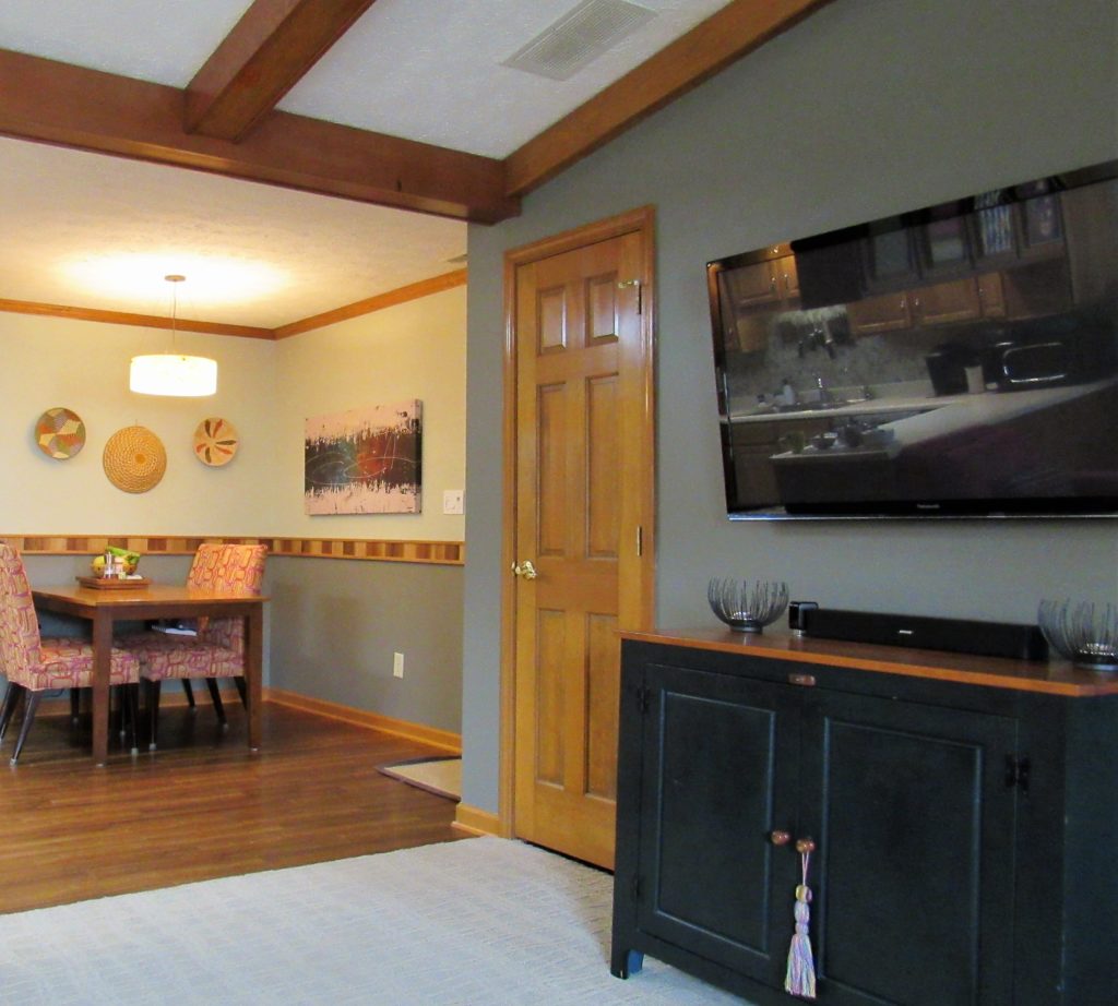
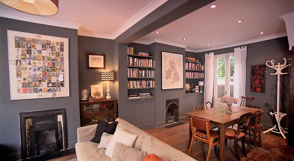
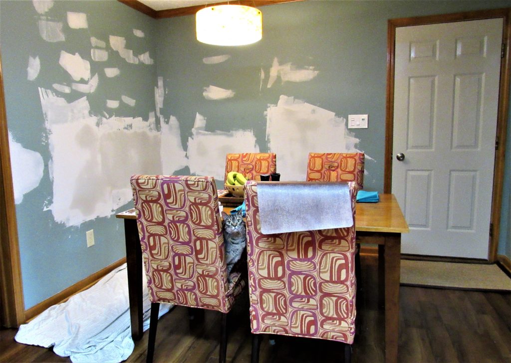
In a recent post I mentioned extending the charcoal gray in my dining area onto at least one wall in my adjacent great room. And, as you can see, that’s one “honey-do” my honey can cross off his to-do list.
The toughest part of this chore was disconnecting all those television, sound-system, and internet-streaming cables, then reconnecting them after all was dried. Masking off the woodwork–what with two doors and ceiling beams on this wall, as well as baseboard–was a close second.
Actually, I’m guessing on that because my honey did it all.
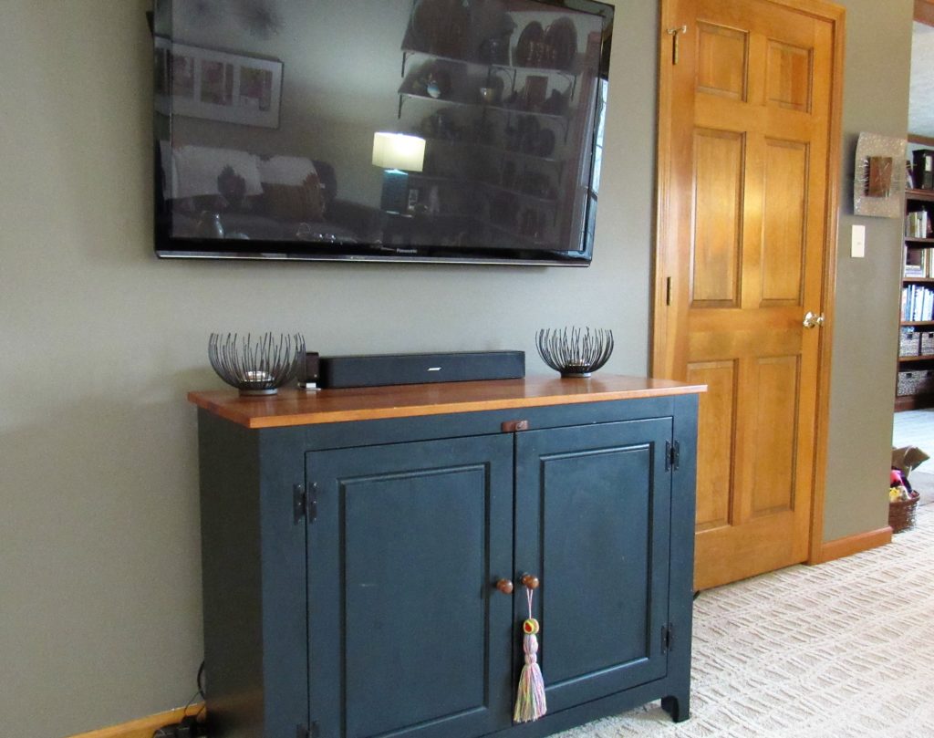
I just swept up and took the pictures afterward. {See me waving at you in the TV screen reflection?) Whew! What a job! But now that it’s all done and the wires are tucked back into the wall or behind the cabinet, doesn’t it look great?
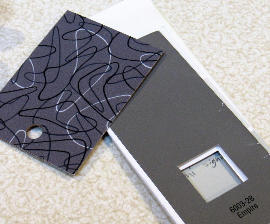
That charcoal gray–Valspar Empire–does wonders for the honey pine, don’t you agree?
It’s one idea I got from this room, restyled during season 2 of The Great Interior Design Challenge. In fact, the judges said darker, warm grays are great for giving cohesion to rooms with lots of wood tones and colorful books.
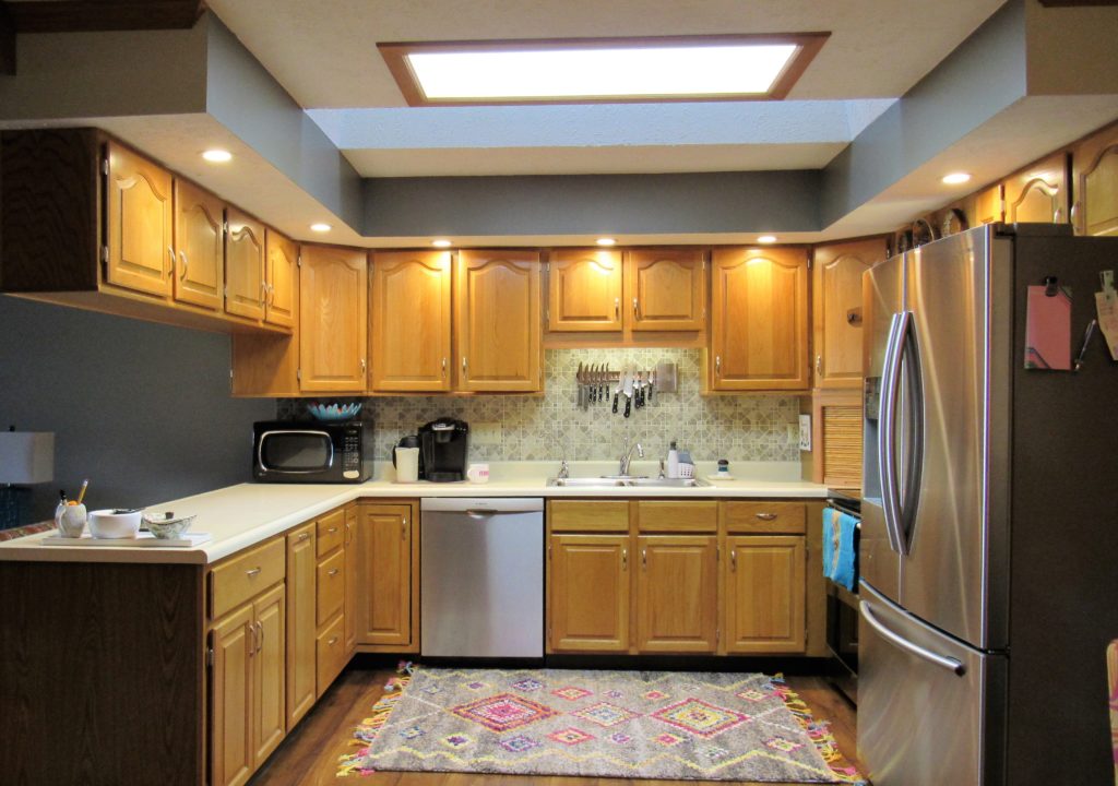
When I watched that, I’d already accented my kitchen/dining area with it and noticed how it unified the wood tones. But it was the comment on the show and this room redone by contestant Charlotte Pearson that encouraged me to continue it into the great room.
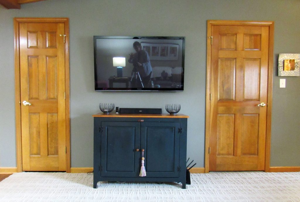
I was also struck by a trick played by contestant Luke Wells, also in season 2 of the GIDC. He painted the wall behind this TV black so the TV would seem less prominent. What a neat trick, huh?
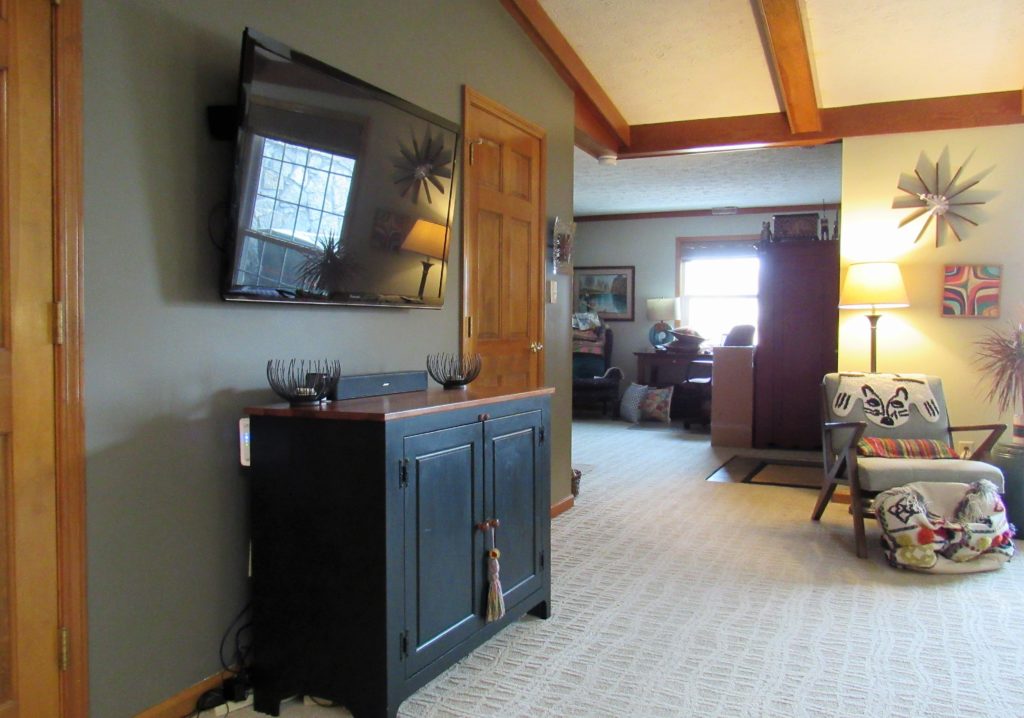
Granted, I was more interested in connecting the great room visually with the dining room. I don’t typically worry about the television sticking out–especially considering how much LESS obtrusive flat screens are than their predecessors.
But I liked the idea of the TV fading back a bit anyway, even though I wasn’t interested in going full-on black. With the darker gray, the black cabinet with its natural wood top seems to stand out more while the TV recedes, all of which is okay with me.
I also considered extending the darker gray onto this wall,
from the inner bulkhead to the ends,
and onto this smidgen of bulkhead visible on the great room side of the kitchen peninsula.
But I wanted to get that TV wall done first and think it through, and I’m glad I did because we decided to stop there. Inside corners are notoriously tough to paint with a sharp line, and we were concerned it would start to look a bit patchy.
Cohesion is what we were after, and I think we achieved it.
But there’s one more thing…
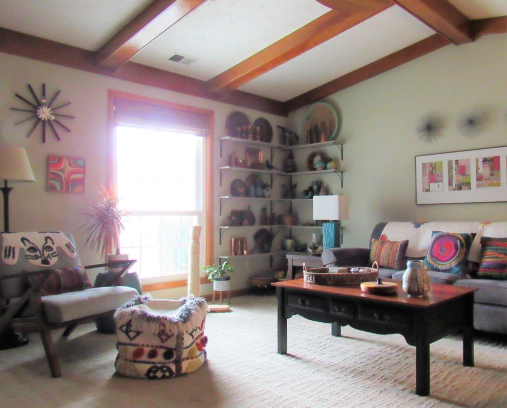
Here’s a view of the rest of the great room, from the dining area. In discussing the color changes with my cleaning lady, she suggested I paint the light gray display shelves in the corner charcoal gray as well.
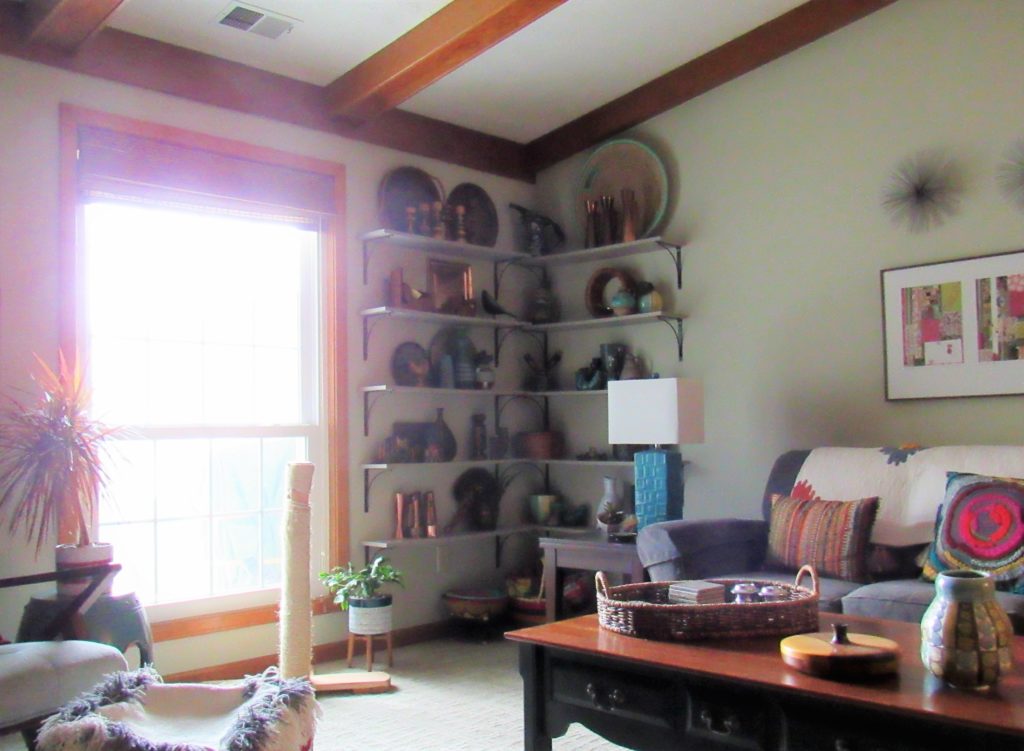
At first, I blew her off completely. I had, after all, chosen light gray shelves so they’d blend into the light gray wall.
And in thinking it through from a practical standpoint, I change out the items on these shelves frequently and can see paint getting scratched up and becoming a maintenance problem.
That said…
I loved how these silver-edged shelves popped against light gray walls in a room done by Lucy Tiffney, in the GIDC season 3, as well as…
…the charcoal gray supports in shelves in another room of Lucy’s. Surely painting just the edges of my shelves dark gray wouldn’t create maintenance issues but just might add some extra impact, right?
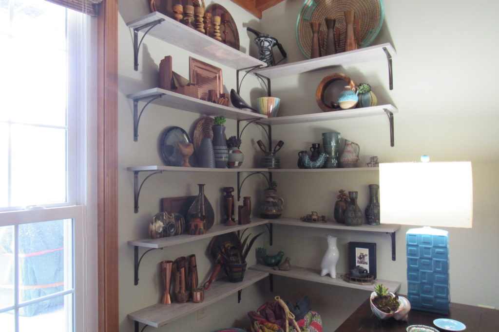
As Is… 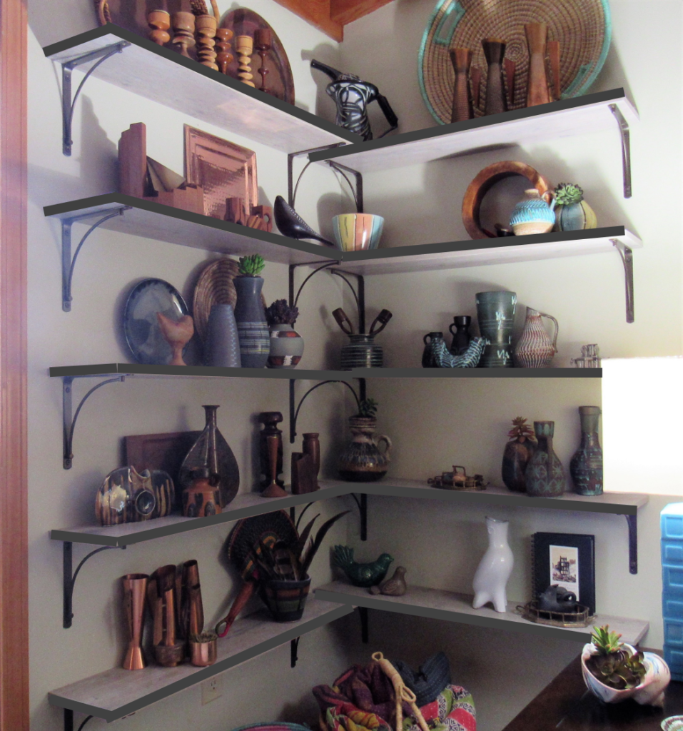
Dark Gray Edge Mock-up
I know it’s a little tough to tell, given the lousy lighting in my great room, especially during winter in Indiana when the days are grayer than my interiors. It’s a busy corner already. Would the addition of the dark gray make it worse or give it some sharpness and definition? I’m leaning toward the latter. Please weigh in!
Because I want to be sure before I make the change.
I researched some sort of dark gray tape, but couldn’t find anything I thought would work. Then I figured I could glue on a twill or bias tape. But that seemed like a lot of work compared to rollering on some paint, which I already have plenty of, though painting will require a bit of pre-sanding.
Chris, of course, is always for leaving well enough alone, particularly when he’s the one drafted to do the job. But this is something I plan to take on myself, IF I can make up my mind.
NONE of the options is completely reversible. So I’d really appreciate your comments on how you think it would LOOK. It’s up to me to decide how best to achieve it, but I’m open to suggestions there, too.
If you want more…

- Check out my favorite ideas from “Binge-Watching The Great Interior Design Challenge,” season 1, season 2, and season 3. (Season 4 is in the works, so stay tuned!!)

Beautiful pictures. I liked this darker shade of gray. Thanks for sharing this post.
My initial reaction was leave them light, so they blend (so that the items would be eye-catching, not the shelves), but in the pictures, I really liked them dark. It totally surprised me! It looked crisp and polished without being a distraction. Not sure you can go wrong, really – both look good!
Thanks for commenting, Becca! Yes, that’s what I thought until I saw some shelves edge-painted. It’s like an underline and draws the eye into what’s ON the shelves.