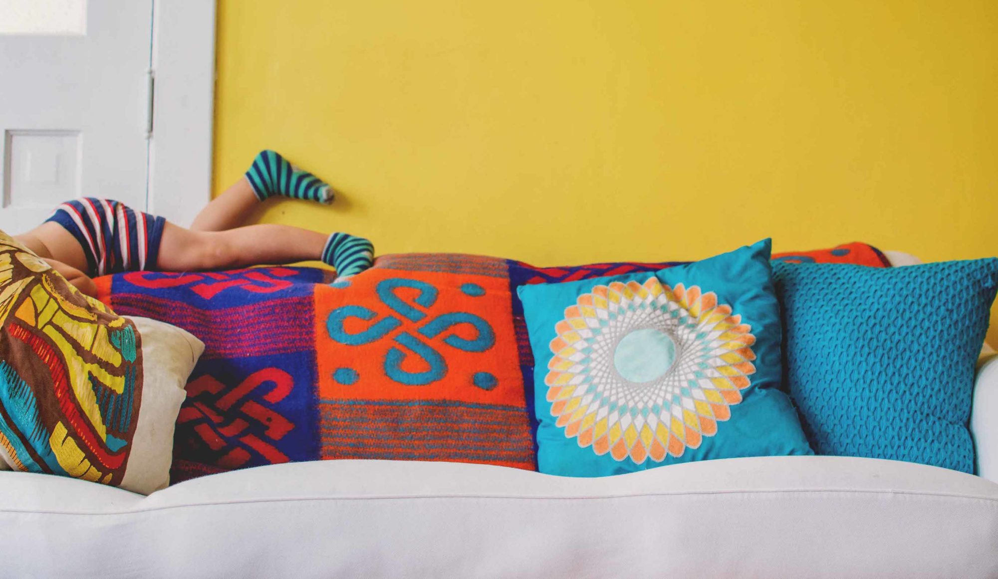
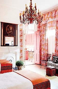
Pantone Color Institute issued a 2018 trends report for interiors last week that said something you may already know: Pink and orange is the new color combo hottie, and we’re going to see a lot of it through next year.
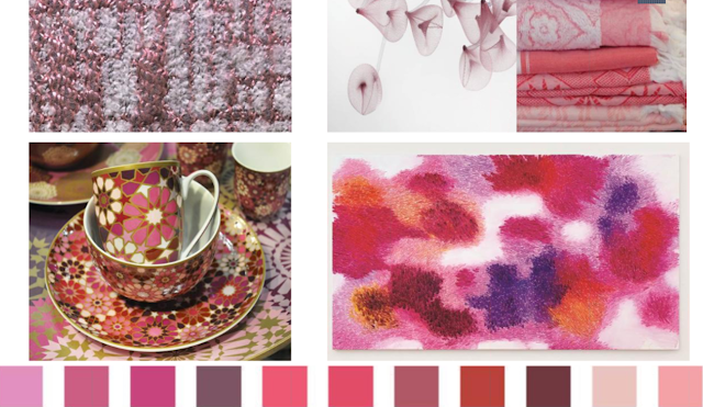
Though they didn’t reveal official PMS numbers for the hottest shades of pink and orange, they did release palettes. Here are the shades of pink to watch for…
 |
| Pantone |
Everything from the palest of blushes to hues approaching purple and terra-cotta.
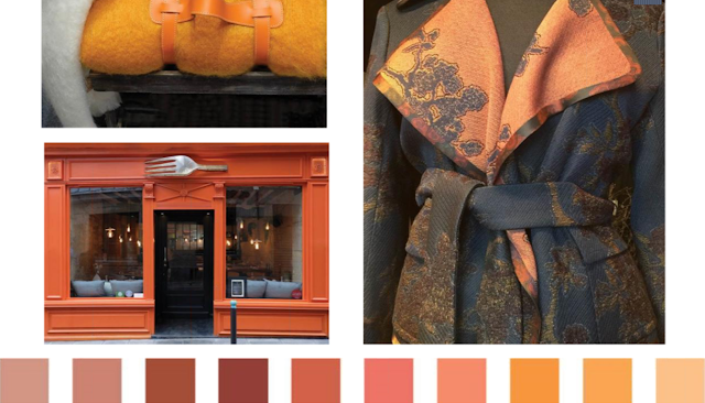
And here are the shades of orange…
 |
| Pantone |
Mostly subdued shades—variations on pinkish-clay all the way up to yellowy-apricot and peach hues.
It all reminds me of a favorite, fruity dessert—a peach melba parfait—that I remember having at the now-defunct Moultrie Tavern in Charleston, SC, on my honeymoon, 28 years ago this upcoming Saturday.
In that spirit, I thought I’d share some rooms I found that seem, like the traditional dessert (left) and its frozen-yogurt and layer-cake spin-offs (right) to make the most of fresh peaches and raspberry puree.
Let’s start with paint
If you’re not ready to reupholster and/or replace all of your furniture, try out peach melba color-blocking on your walls. I found several delightful examples of this…
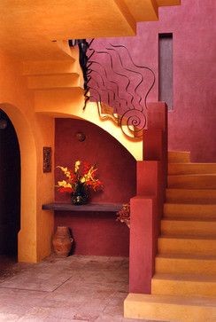 |
| Houzz |
 |
| Via Achados de Decoração |
 |
| Found on Flickr |
But unless your mind just naturally thinks in color-blocks, I’d leave the paint until last. At least that’s what most interior designers recommend. That doesn’t mean you can’t begin with an inspiration. Particularly with such a bold choice, it helps to have a reference point.
You could start with art and build out
 |
| Anna Spiro |
This painting offers a bold dose of pink that cuddles up nicely with the persimmon sofa. The modified-stripe pillows marry the two harmoniously.
 |
| Via Habitually Chic |
LOVE that larger painting with the pink background against the peachy-keen wall! The pink table beneath gets the color combo moving. The orange is found again on the rug (accented with a bit of pink) and the pillows and throw wrap it all together on neutral furniture.
This is a perfect illustration of why neutral upholstered pieces are so terrific. White, cream, beige, or gray, you can completely change accessories in your room for a whole new look.
These chairs make a bold statement with their raspberry upholstery and peachy pillows. Their inspiration, however, is more subtle. Take a close look at the two paintings of Chinese figures, a man and a woman. The pinks are in the man’s coat, and the oranges are in the skirt that hangs out beneath the woman’s coat. And because of the subtlety, the chairs really pop!
 |
| Jai Vasicek photo / Adore Magazine |
Most of the pink and orange color scheme here is in the painting, and it gives you an idea of how close these hues are to each other. The pillows and the geometric rug reinforce this marriage made in nature. Think sunrise, sunset.
 |
| Melanie Acevedo photo / Domino |
The pink and orange painting in this bedroom not only sets the palette of the room, but its lines also mimic the lines of the chandelier. Or is it the other way around? Regardless, the two reinforce each other, and I’d expect nothing less from a Kelly Wearstler-designed room.
Color-wise, the bedroom leans toward some of the more purply pinks. It’s a bit hard to tell, but it looks as if the headboard upholstery may be an orangey-pink on a deeper ground.
 |
| Tony Vu / One Kings Lane |
Each photo is the opposite end of the same room in Nisbet’s Manhattan apartment. It helps to look at them together, though, to see how the art has set the color palette. Adding orange drapes and pillows and raspberry velvet chairs was a no-brainer when drawing from such vibrant paintings.
Take the grand tour of the entire apartment at One Kings Lane.
 |
| Tony Vu / One Kings Lane |
Or fall in love with a textile and go from there.
 |
| John Gruen photo / New England Home |
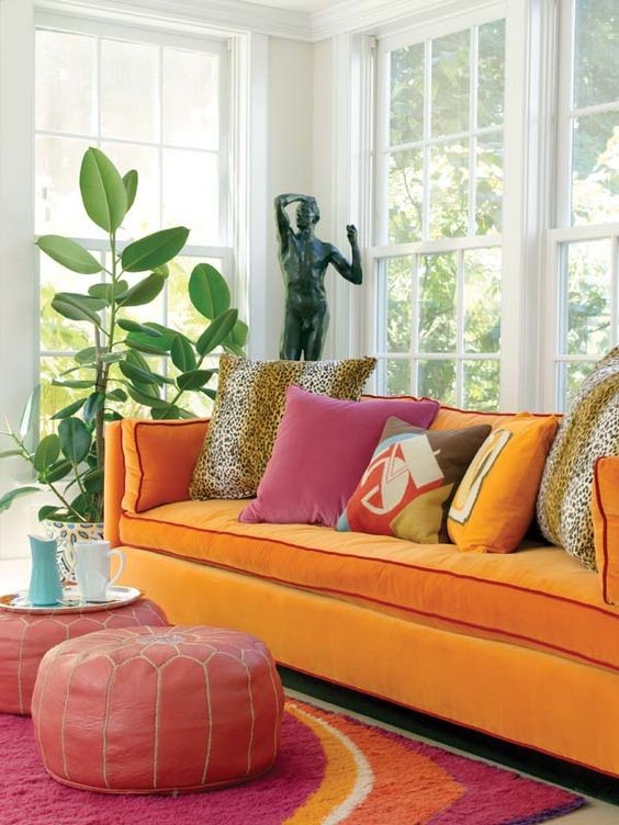
Maybe it’s an area rug that will catch your eye and give you the courage you need to go for the apricot velvet sofa with the raspberry piping. See more of this home at New England Home magazine.
 |
| Via Forgive-Ness / Tumblr |
Or maybe it will be the combination of two very different rugs layered—which is another trend. One rug here is geometric and the other is striped, which means they work well together, particularly since the pale, yellowish orange of the geometric appears in the stripe. The sofa color represents the more vibrant orange in the geometric rug, and the floral pillow, which mixes well with both rugs, contains all the colors.
 |
| Via Décor Pics and Home Decorating Ideas |
This bedroom vignette has so many good things going on that it’s tough to decide which was the inspiration. I’m going to choose the floral pillow sham, with its vibrant orange background and raspberry pink flowers. It’s certainly what brings together the rest of the bedding and the art.
Obviously, the framed black and white textile works well with the black bedframe and campaign chest. I’m loving the pink matboard used, as well as the pops of blue.
Good things come in 3s
 |
| Andrew Arthur photo / My Domaine |
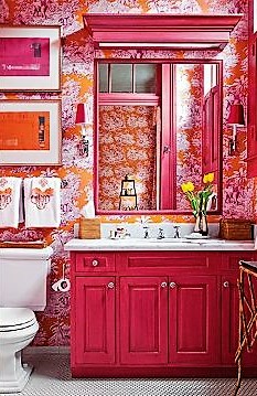
Believe me, it takes at least three photos to sing the glories of a Manuel Canovas fabric, like the one used on the walls, bedskirts…
 |
| Andrew Arthur photo / My Domaine |
…as well as on the walls of the en suite bathroom in this Lousiana home designed by Melissa Miles Rufty. See more of this Greek Revival rowhouse in the Garden District of New Orleans on My Domaine.
Sometimes it’s tough to pick out the inspiration
 |
| Roger Davies photo |
What would you guess was inspiration for this uber-sophisticated, multi-layered room in the Sao Paulo home of Brazilian architect and designer Sig Bergamin? The rug? The pillow textiles? Those matching raspberry velvet sofas that look yummy enough to eat?
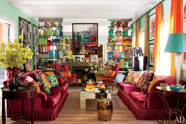
Maybe another view of the same room will help…
 |
| Roger Davies photo |
I’m guessing it was the glass collection, displayed against mirrored walls, but it may easily have been a combination of elements. Bergamin loves color and knows how to use it in mucho-megadoses. Continue your tour of this home at Architectural Digest
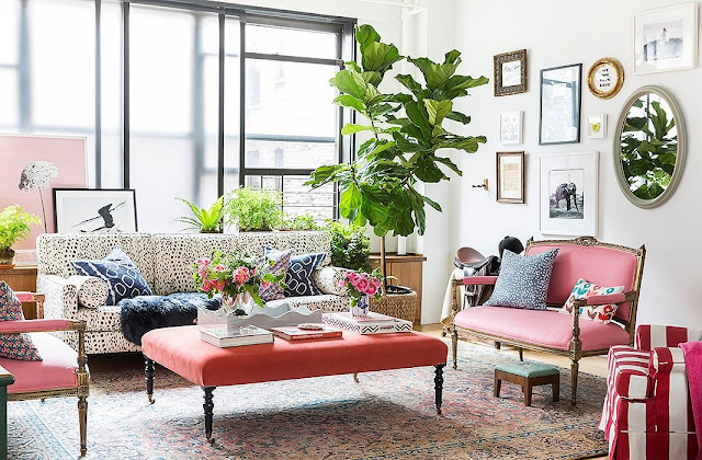
This one’s a bit tougher. Where’s the orange?
 |
| Lesley Unruh photo / One Kings Lane |
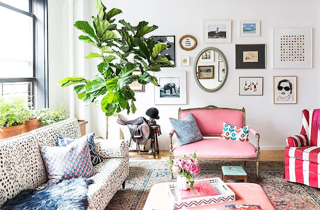
But the cocktail ottoman is a coral-salmon color. And although the matching settees look pink to me, they’re also described as coral, though a different shade. Either way, ALL the pink and orange hues in the room are just a little different and range from the palest blush in the carpet to the bold raspberry stripes of the chair at right.
 |
| Lesley Unruh photo / One Kings Lane |
I’m guessing the inspiration was painting itself, though not any particular painting. Owner Kate Schelter’s first passion is painting watercolors, an art form in which one color veritably fades into another, and that’s the effect achieved here. I adore how it all works with the fun animal-type print on the sofa.
Take the full tour of this Chelsea (NYC) loft Schelter shares with her husband, daughter and dog at One Kings Lane.
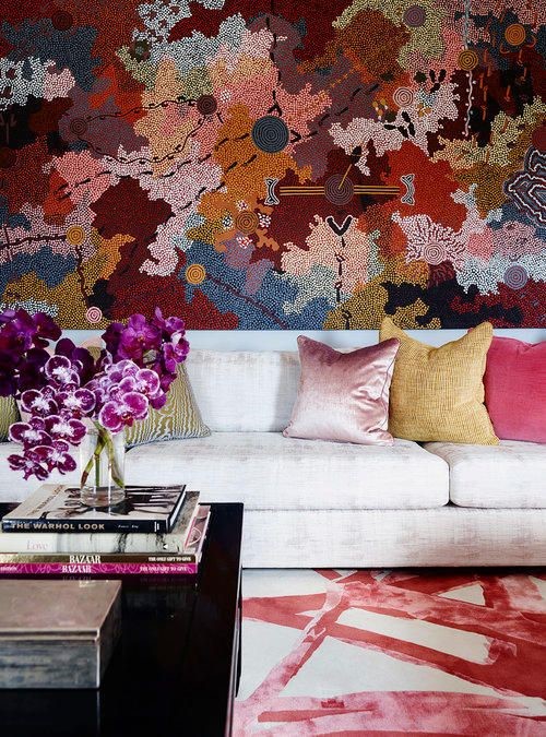
I know it’s the carpet, but which one?
 |
| POCO Designs / Via Desire to Inspire |
Was the inspiration the abstract floral carpet on the wall or the ribbon-like one on the floor?
 |
| POCO Designs / Via Desire to Inspire |
Or is it the painting hanging opposite the wall-rug? I’ll let you decide. My only certainty is you can take the full tour of this Sydney, Australia, apartment at Desire to Inspire.
2nd-guess Alexa Hampton? No way!
 |
| Steve Freihon photo / AD |
 |
| Scott Frances photo |
Those views are easier to see in this earlier iteration of the room, which Hampton says she hated because the room didn’t stand up to the views. It was lovely, but she may have a point.
 |
| Steve Freihon photo |
I do like this version much, much better, don’t you? Continue your tour of Hampton’s apartment HERE, and learn how a designer handles her own mistakes HERE.
Hampton’s lesson: Always go bold.
 |
| Indulgy |
Confessions aside, I love how this last room has good color bones with black bookshelves, a multicolor oriental rug, and this luscious pale-gold velvet sofa. Accessorizing could go any number of ways, but a framed block of pink, two peachy pillows, and a rust-colored flower pot bring it up-to-date with where we’re headed for 2018.
If you want more…
- Check out last week’s post “On FLEEK: What’s the color landscape for 2018?” for a broader look at emerging color trends.
- Learn about the color forecasting industry and access Pantone’s color intelligence reports.
- Sign up to received Tones, Pantone’s email newsletter.
- Sign up to receive Pantone news and notice of free webinars, including those announcing colors of the year.
- Become a BoHo Home follower in whatever way works best for you: Sign up to have posts sent to your inbox using the subscription link in the sidebar (top right). Or, follow my blog with Bloglovin, a social-media platform that allows you to set up an account and access all the blogs you want to read in one place.
