

The sixth and final season of Downton Abbey airs in the UK sometime this month and in the US on PBS come January. Every Wednesday from now until then BoHo Home will run a feature on how to bring a bit of the Downton style into any home.
Since this January will be our final look at the characters and places we love (except on DVD), I’ll try to ensure you see it with new eyes and know how to keep a bit of it close.
1st up: Cora’s drawing room, step-by-step
View the slide show of actual scenes from the series with your favorite characters, in this room. Then we’ll take a look at the room from all angles, sans lords, ladies and servants…
1. Drama begins with color and texture
Downton rooms are decorated in the Edwardian style, which was lighter and brighter as a reaction to the heavy and dark Victorian period that preceded it. That lighter-feeling, cheerier palette is EASY to adapt to any room in any home, and Kelly-Moore Paints have made it even more so by creating a collection of Downton Abbey colors.

In Cora’s drawing room the colors are a filmy aqua (K-M’s Sonoma Sky) on the walls (wallpaper, to be exact, in a damask pattern), a peachy pink (Cupid) on the upholstered sofa and chair, and a creamy beige (Summer Sandcastle) on the ceiling, doors, wainscoting and mouldings. The accent is gilded gold and lots of it.
Textiles include a Persian rug, tapestry pillows and chairs, damask upholstery, and even the embroidery Cora sometimes works on in this room. The aqua walls often photograph pale blue or green, depending on the time of day and, of course, the adjustment of your computer monitor. “Cupid” is a chameleon color as well and often photographs peach.
2. List elements you see in different room views
- Luxurious fabrics and textiles
- Plump, over-stuffed sofa and chair
- Stunning architectural mouldings
- Crystal chandelier
- Urn-shaped ceramic lamps
- Sheraton-style case goods in dark woods
- Fresh flowers
- Family portraits in heavy gilded frames, hung on cords from a picture rail
- Family photographs on tables

- Marble fireplace with black swirl
- Upholstered ottoman (for fireside sitting or as coffee table)
- Bronze figurative candelabra style lamps with small shades
- Porcelains in blue and white, some in vase and urn shapes

Now here’s the room from the opposite side. A few accessories are different, perhaps owing to which TV season the photo hails from. Anything to add to the list?
I added:
- Floor lamp
- Multiple seating areas
- Curio cabinet to left of door
- Black enameled and gilded secretary (or liquour cabinet?) to right of door.
- Area rug overlaid on room-size rug

In yet another view, we see decorative plates in and on the curio cabinet. Another new detail I noticed was the blue-and-white inlay on the side table–some sort of porcelain perhaps? Exquisite!
The slideshow photos may reveal other subtleties. What’s important to focus on is, what SPECIFICALLY makes you absolutely love about this? If it makes you feel soooo good, why? Don’t proceed until you figure that out. Once you do, any of the items in your list, individually or as a group, can help you achieve the look and FEEL you want, regardless of budget, if you approach it creatively.
3. Find inspiration photos of rooms that give the same feeling
Remember, we’re not necessarily looking for Edwardian rooms fit for a country estate. We’re looking for sumptuous, feminine, welcoming, light-filled rooms. So start with the color palette (aqua/mint/turquoise and pink/peach living room) and search:
- Google, Yahoo, Bing or some other search engine.
- Your favorite blogs. House of Turquoise has lots of rooms in similar color palettes.
- Houzz. Many designers who don’t post elsewhere post there.
- Pinterest, where everyone reposts.
Be careful what you rule out early on. You’re brainstorming, so keep everything that feels right! If you don’t already have a free Pinterest account, start a board and save your inspiring finds there. I’ll get you started with my Lady Grantham board. Pin to your board any you like and keep on searching.
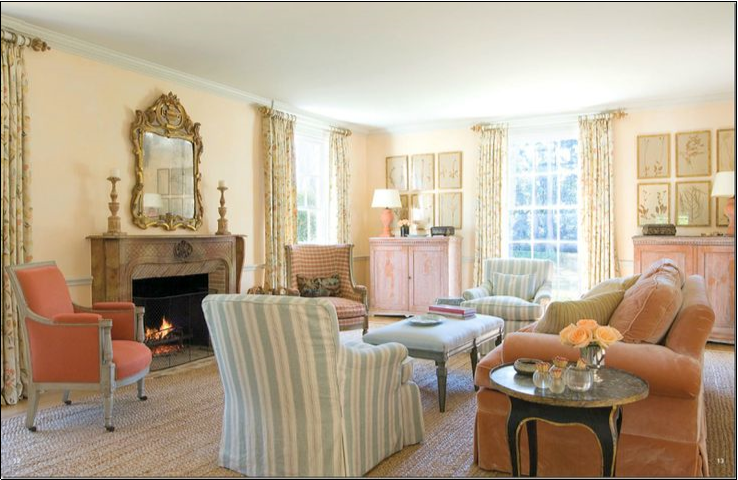
Here are six photos I found that come close…
 |
| Carol Glasser Interiors |
 |
| Julie Mifsud Interior Design |
 |
| Meg Braff Designs |
 |
| Debra Lynn Henno Design |
 |
| Anita Clark Design |
 |
| Found on Tem Gallery |
All these rooms are feminine, full of light and cheer, elegant but comfortable, and scaled down for modern living. But alas, all are still a bit formal for boho me.
So here are six more photos, a bit more casual and bumped-up with some boho edge…
 |
| Found on HGTV |
 |


 |
| Found on CNB Home Design Ideas |
 |
| Found on Shannon Berrey Design, home of photographer Wendy Updegraff |
Same feminine, airy, light/bright, welcoming feel; right? I know I’d be perfectly at home in these last six. And I’m guessing one of our favorite and much-missed Crawleys–Lady Sybil–would enjoy joining me there for tea. What do you think?

I apologize for not responding sooner. I think my notifications got turned off accidentally. Please feel free to link my post to yours, even though it’s so long now after the fact. Thanks for reading and commenting.
Would you mind me linking your article on my upcoming blog post on Downton Abbey?
I am in love with the DA decor!
Tracy Xavier