

If you don’t know who Sophie Robinson is, whereya been? She cohosted three out of four seasons of the British TV bonanza The Great Interior Design Challenge and now has her own podcast, The Great Indoors, as well as online interior design courses.
She’s a self-avowed color-crazed maximalist, and the COVID-19 lockdown has kept her busy making changes around her very own English country cottage. She shared those changes recently on her blog, and I wanted to comment on them here. I also hunted around the Internet to find some “before” photos of the same rooms that recently got the wild-and-crazy Sophie-redo touch.
Begin at the beginning
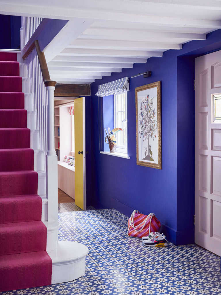
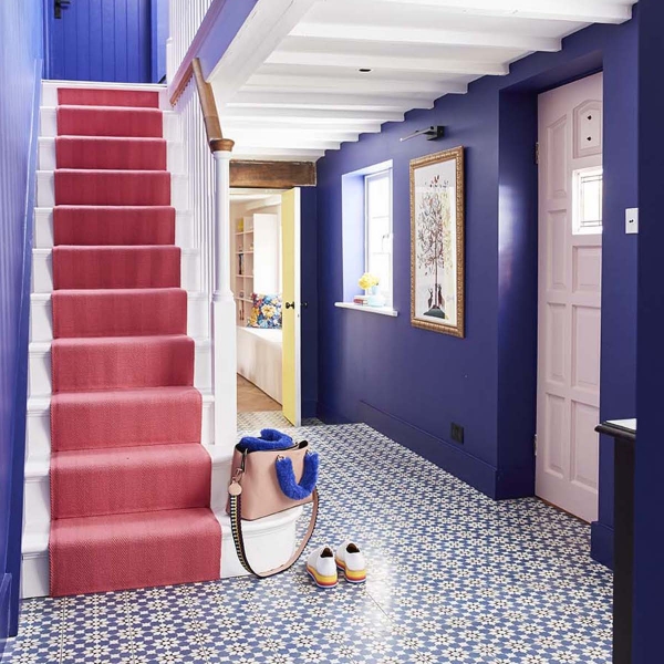
Welcome to Sophie’s spiffed-up entry hall. Seems the big decision here was choosing a patterned fabric for the window treatment that allowed the raspberry-pink stair runner to star. Podcast pal Kate Watson-Smyth suggested sticking to the blue-and-white palette for that very reason. The print Sophie settled on echoes the patterned tile floor in the same colorway, and all is calmed and unified by the electric blue wall paint–a color which is, by the way, a Sophie fave.
Alun Callender photos 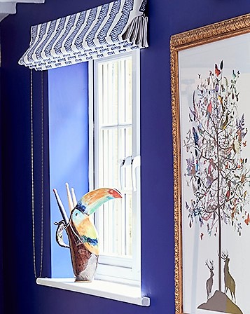
Apparently BIG changes weren’t needed here, as the before photo at left shows NO window treatment and a bit different styling. Me? I just want a closer look at the sculptural bird pitcher added to the windowsill. Gorgeous!
Follow the red thread
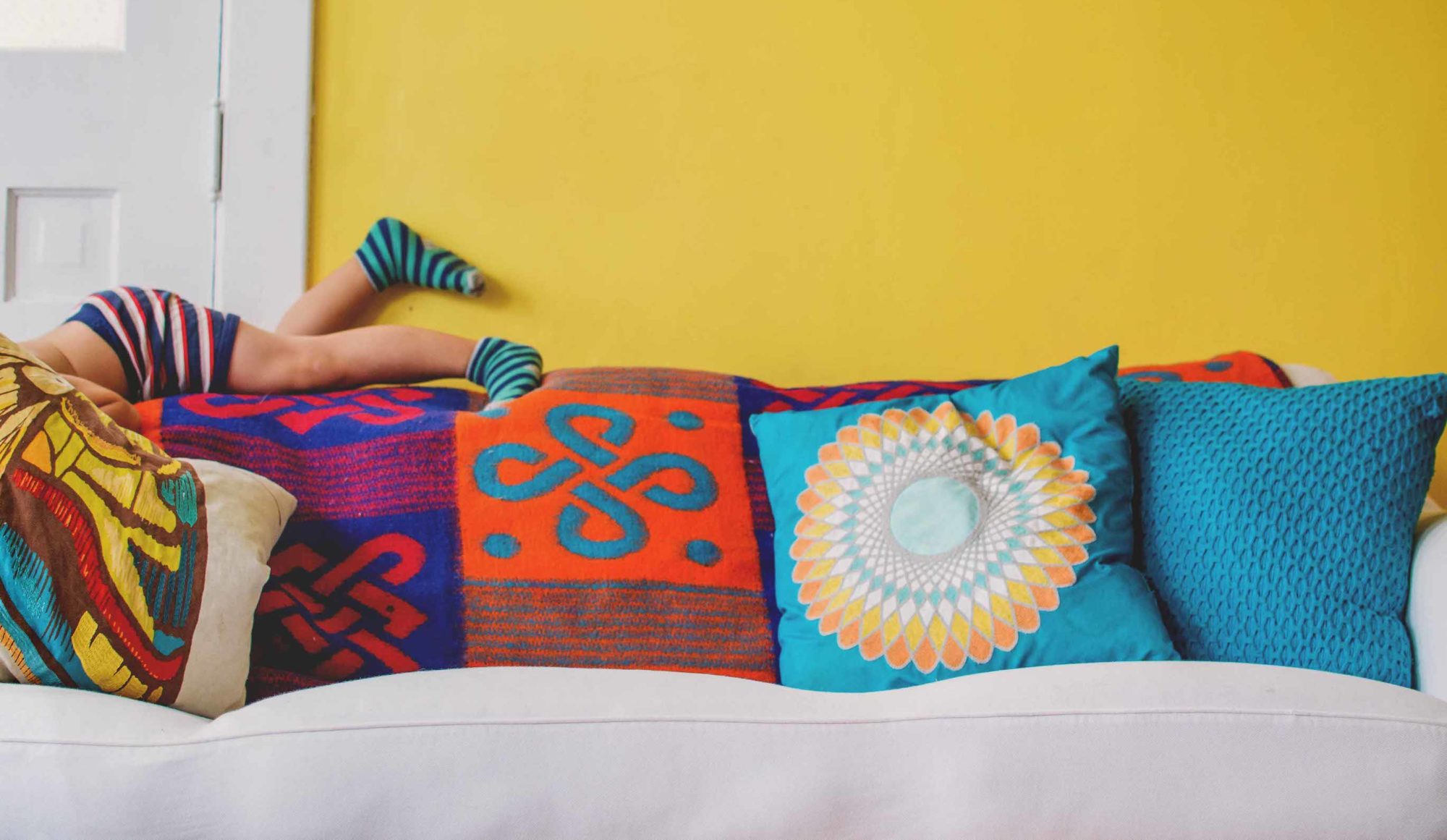
Sophie likes to say there is a red thread (which includes pinks) running through her entire home, and that is certainly apparent in the living room.
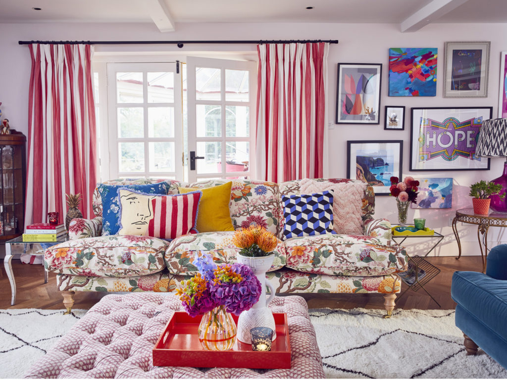
The striped window treatment bring calm, and I like how it’s repeated in part of just one pillow. The white walls are a great backdrop for all the color and echo the white background in the sofa print.
I can even tolerate the white-and-black-patterned beni rug, which I identified as a “Oh-No-Boho” cliche several years back. As Sophie tells it, Kate Watson-Smyth wanted the same rug, but Sophie talked her out of it on cliche grounds then went out and bought one for herself. That’s two she owes Kate.
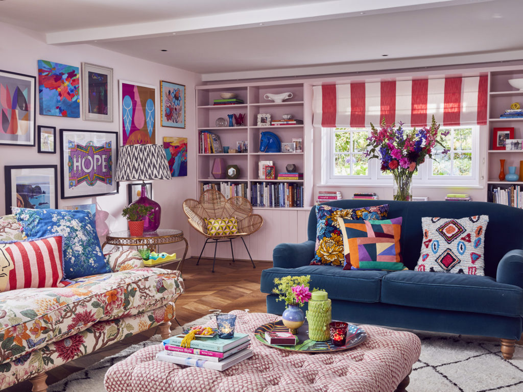
I like how Sophie manages to incorporate so many of the colors in her central print–the floral sofa upholstery–as she styles a room. Bits of orange, raspberry, yellow, blue and green pop up everywhere.
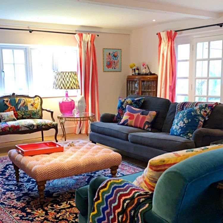
As the “before” shot on the left reveals, the big change in this room was achieved by the more reflective beni rug and reupholstering one blue sofa in the floral print. Together, they really brighten the room and make it dance.
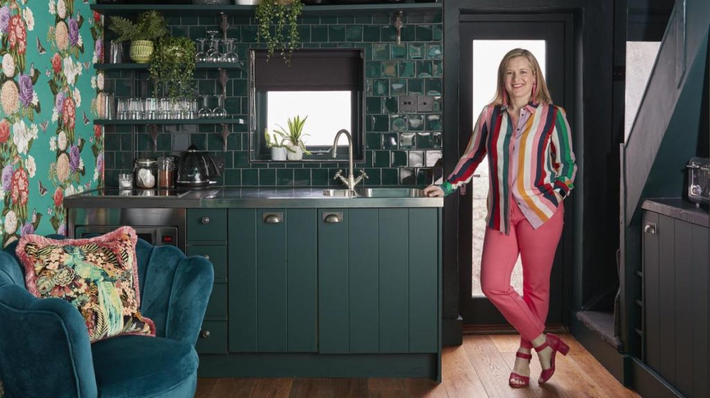
Cook up more color
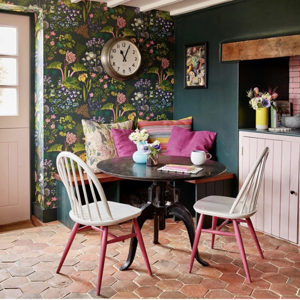
I’m admittedly not a wallpaper fan. But if I WERE, I would be going all out for this one. Makes you feel like you’re taking yoru morning tea out in a garden, does it?
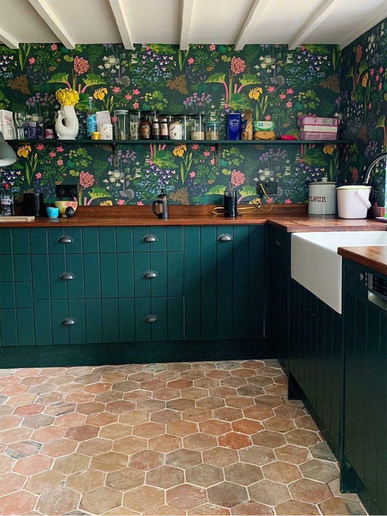
Love how the pattern wraps itself around the workspace. There’s also a nice mix of texture in this space, what with the tile floor and the wood countertops. And don’t you just love how the yellow flowers in the fish vase seem to have come alive right out of the wallpaper?
These two “before shots” show a gradual change to the kitchen. Gone are the upper cupboards, tile backsplash, natural wood lower cabinet, and baby blue hanging shelf in the photo on the left. Though teal lower cabinets enter into the photo on the right, the wallpaper is different and the stainless steel counters are gone. I think she’s moving in the right direction!
Powder, primp, say ahhhhhhhhh!
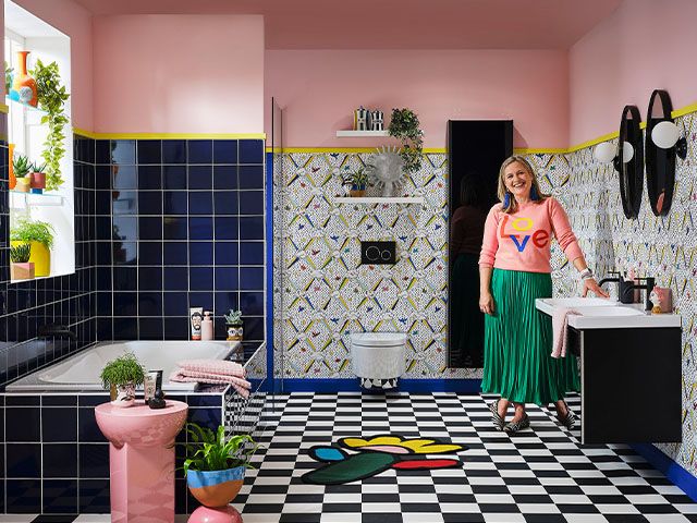
Before you freak out too much, this is a BEFORE photo. If I understand correctly, part of what Sophie did was divide up this rather larger bathroom into a wet room with a shower, sink and toilet, and a spa-like tub room with sink and loo. I have to say this room seems like hot mess to me. I inherited some ugly pink patterned tile which I’ve yet been able to afford to replace, but it’s a whole lot better than what I see here.
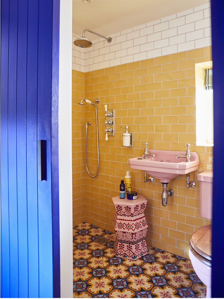
Now onto the revamp: Looks like she kept some of the pink fixtures in the wet room and paired them with patterned floor tile in yellows, blues and pink/reds, then added yellow subway tile on the walls, topped by several rows of the same tile in white.
It’s an odd combination at best. The white band of tile around the top lightens the effect. And I do like how the pink-patterned stool/table seems to have bloomed right out of the floor tiles. It certainly works on some level, but wouldn’t make it into my house.
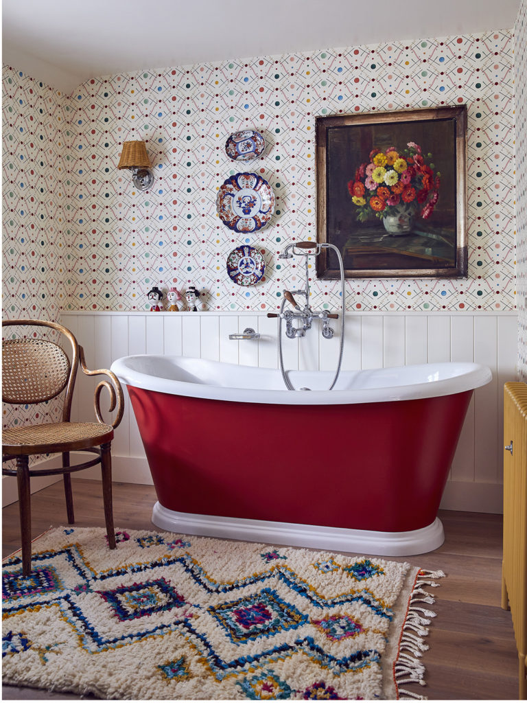
The tub room, on the other hand, is just my cup of tea, as the Brits say. Its inspiration was a living room, according to Soph, hence the wood floor, comfy rug, wainscoting and ditzy wallpaper, and, of course, the carry-through of the red line in the tub.
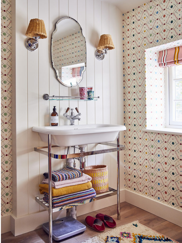
Sophie says she plans to skirt the sink as soon as she settles on the right print AND can get it installed without husband Tom noticing. I like it as is, though, with the stack of fun-printed towels and colorful basket. And I do so love the striped window treatment.
What an inspiration for a boho bath…
…as well as a MONUMENTAL improvement.
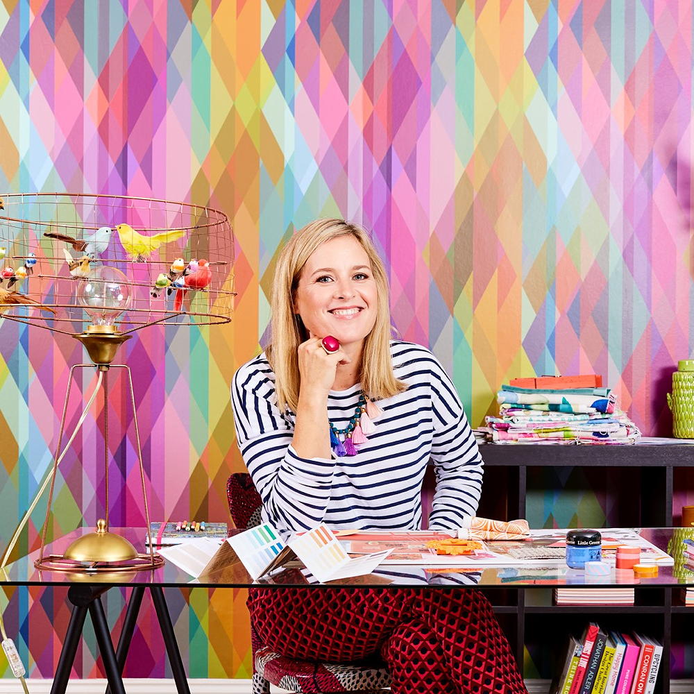
Make work play
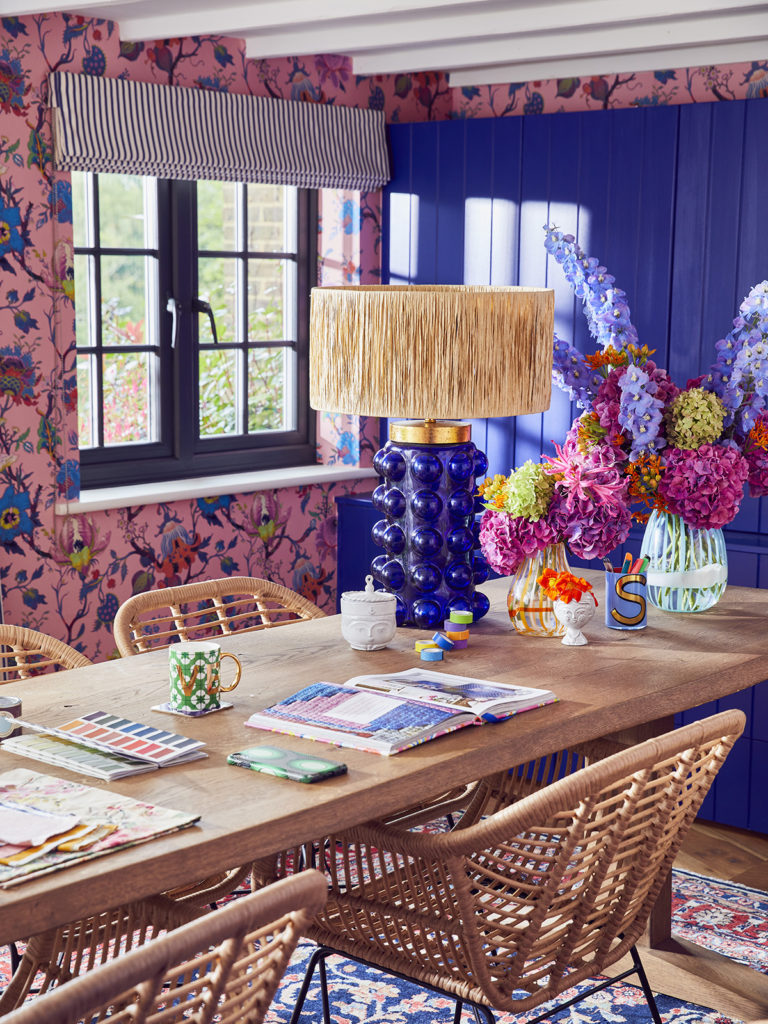
There’s lots of electric blue, so this must be Sophie’s own personal space. I ADORE the blue lamp with its grass shade–so midcentury mod! And I love how the fresh flowers in the vases seem to grow out of the wallpaper.
About that wallpaper: Sophie says it took her out of her comfort zone, largely because husband Tom didn’t like it. But it stayed on her wish list, and so she went for it in a big way…
…wrapping most of the room in it rather than settling for a mere statement wall. I think her boldness is what makes it work. Again, I love how she accessorizes with even bits of orange and lavender found in the print.
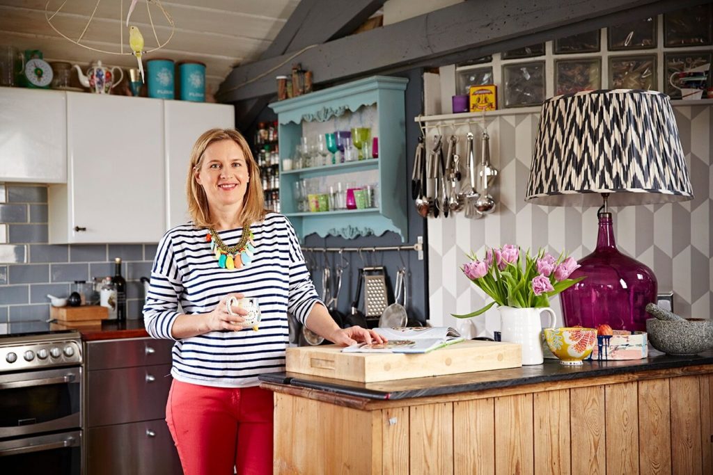
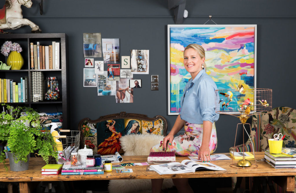
And it’s a big improvment from some of her earlier offices:
Alun Callender photos 
These all look pretty dated to me. HATE that wallpaper in the left photo, and though I love charcoal gray, it’s just too tame for Sophie.
Tune back in for Tom
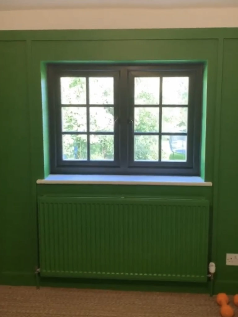
Well, Tom’s private office space is slated for a redo, too, depending on how long this lockdown lasts. So far he has a new wall color. Sophie chose this resplendent green because Tom’s favorite place is outdoors.
And I can’t question her taste…
It looks a lot like the color we just painted our bedroom. What GREAT taste she has! Or I have? Whatever. We’re both killer boho mamas.
You can never get too much of Sophie, so…

- Listen to her Great Indoors podcasts with pictured pal Kate Watson-Smyth (the queen of grey who wore tongue-in-cheek sunglasses to Sophie’s redo unveiling).
- Take the full tour of Sophie’s house redo, explore her blog, and give her online courses a look-see.
- Check out Kate Watson-Smyth’s blog, Mad About the House, as well as her books (affiliate links):
You might also enjoy my posts from a couple years back on “Binge-Watching The Great Interior Design Challenge”:
- 10 Faves From Season 1
- Season 2 Tricks & Triumphs
- Season 3 Fabric Fun & More
- Season 4 Unseemly Seamless

Hi, this blog post has some glaring errors that you might wish to fix bc Sophie Robinson fans will know it and it reflects poorly on your research. Would be a shame to lose readers for this reason. The bathroom with the geometric wall paper is NOT a before photo. It was a room she designed for Geberit. It’s not her house, and it’s a AFTER photo. Kate Watson Smythe decorated the same bathroom as part of the same job for Geberit. If you look on Sophie Robinson’s Instagram, all the info is there and on her website. Best wishes to you.