

I ABHOR choosing paint colors but thought I stood on safe ground when I decided to paint my master bathroom the same color as the master bedroom. After all, what I loved in one room should transfer to an adjoining one, right?
Wrong. So wrong. In so many ways, wrong, wrong, WRONG.

My master bedroom is Valspar Churchill Hotel Wheat, a warm, mellow shade of tan that feels like a coffee-with-cream kiss every time I walk in. The bedroom has but one window and gets the afternoon sun but also a good bit of morning sun reflecting off the house across the lane.
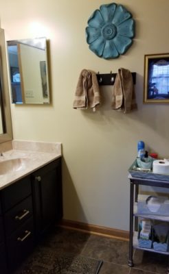
The adjoining master bath, on the other hand, has NO windows. Its door is across the room from the bedroom window and gets but a little light from it. We generally must turn on lights even during the day to use the room.
Still, how different could it look? Tan is tan is tan, I’m thinking.

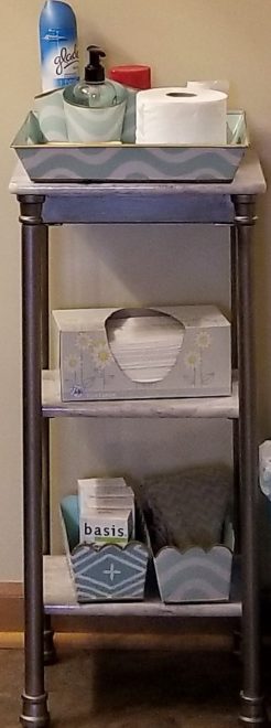
But when we rolled Churchill Hotel Wheat over the existing blue-green Martha Stewart Milk Pail, all I could see was yellow. And while I love yellow in its place, I did not want a yellow bathroom. Not this yellow anyway. I know it doesn’t look as yellow in the photo, but believe me, it was nasty.
‘Wait for the second coat.’

That’s what husband Chris said. So I waited, and I hated it even more. It was even more yellow, and it clashed with the blush overtones in the cultured marble countertop. ICK!
Who thought a little bit of LIGHT (or the lack thereof) could cause sooooooo much difference? But, of course, it does, which is why I HATE HATE HATE choosing paint colors.

I really didn’t want to ask–nay, BEG–Chris to repaint. He says now he absolutely wouldn’t have, but I probably EVENTUALLY could have threatened cajoled him to. He surely saw the wheels turning in my head as I sank from a standing position with hands on my hips into a rumpled crouch on the side of the bed, my lower lip pushed out into a pout.
Fearing the fetal position not far off, Chris suggested brightly, “Let’s get different light bulbs.”
“What? What difference will that make?” I scoffed.
“Could just do the trick,” he replied. “These are warm white LED. We could buy cool white ones and see. It’s worth a shot anyway.”
Especially to avoid repainting (and irreconcilable differences).
Anyhow, it made a BIG difference!
What a SMART guy I married!!
Naturally, though, I still wasn’t satisfied
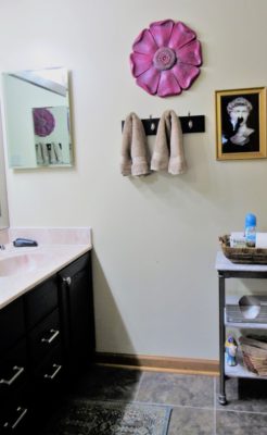
My plan had been to replace only the worn-out aqua shower curtain with a tan one. But now it looked as if I needed to switch out more accessories in the aqua-turquoise-teal line (which used to go with master bedroom accents) for items that tied the room in more with the current master bedroom, where accents are now magenta and orange.

Instead of spending money on new stuff, though, I gave one wall hanging a facelift and went shopping in my own ebay and Etsy stores for the rest.
The architectural flower in the wall arrangement above is made of a lightweight composite material and had an artifically aged appearance when I bought it. If you look back at earlier photos in this post, you’ll see it was turquoise.
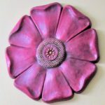
Here’s how I transformed it to look like a gorgeous hot pink cosmos, one of my favorite flowers:
- Sand the existing aged turquoise finish to give tooth to new paint.
- Spraypaint with Rustoleum Magenta Satin.
- Sand again, particularly around the edges to knock off a bit of new paint and let the underlying turquoise peek through in spots.
- Dot the center portions where the flower’s pollen lies, first with a bright yellow paint pen then, when that dries, with a smaller dot of bright orange.
- Add a bit of black craft paint to brown, then thin with water to make an antiquing solution. Paint that on then wipe most of it off, as you would stain. It will sink into the crevasses and scuffed portions.
- Sand AGAIN, lightly.
- Polish with a tack cloth.
I thought I’d need to spray with a clear gloss at the end. But tack cloths contain linseed oil, and that provided just enough sheen for my sensibilities.
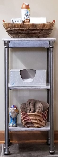
Different baskets and tchotchkes did the trick on this tableshelf.
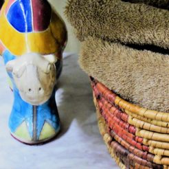

I especially love this little guy–a handmade pottery piece I found on ebay for a song. I planned to resell it, but he fits here perfectly and is just too cute not to keep, at least for now.

I accented the sink/mirror area with this sweet handcarved elephant tealight and a vintage 1960-70s German studio art pottery vase by Elmar & Elke Kubicek. If you want to purchase either one, follow the links to my Etsy shop, and I’ll be glad to find something else to trick out my countertop!

Accessories in the toilet/shower area stayed the same, with the exception of the shower curtain mentioned before. The rugs are dark teal, black and tan, and still seem to mix in well–I think because of the painting over the toilet, which is a reproduction of murals from the ruins at Pompeii. The owl plate below it is from Anthropologie.
And so that’s it–a marriage preserved by light bulbs, and a decorating disaster headed off by that smart cookie I married. Love you Chris!
If you want more…
Follow the metamorphosis of my master bathroom over the last several years in these posts:
- The 80s Called & Wants My Master Bathroom Back–Reno Part 1
- The 80s Called & Wants My Master Bathroom Back–Reno Part 2
- The 80s Called & Wants My Master Bathroom Back–Reno Part 3
- Rescuing My Master Bath from the 80s–Reno Part 4 (Final, We Hope!)
And check out the transformation of the bedroom that adjoins it in these:
- Planning My Master Bedroom Refresh – Part 1
- My Master Bedroom Refresh – Part 2
- My Master Bedroom Refresh Finale
- YAAAS! This. My Boho Bedroom. Pronto.
- Boho to Bed with Birds-Eye Inspiration
- A Spring Refresh (& a Wish Come True) for the Lawson Bedroom
- Powder & Primp with My Craigslist-Find Dressing Table
- How to make envelope pillows and shams
- How to Lengthen and Embellish an Existing Throw
- How to Transform an Inexpensive Rug into a Textured Wall Tapestry