


Every office needs an “idea center,” and Don Draper’s executive office couch was, perhaps, the 1960s version. But my “mad man”–the one I’m doing this home office/guest room redo for–much prefers being on his feet when generating great ideas.
Perhaps something more like this is “suited” to his needs…

YES!!
I’ve struggled for YEARS (literally) trying to figure out what to do with items purchased on a hunch they belonged together in Chris’ office. That is, until I saw this photo. I guess I was stuck on that image of Mad Men‘s Don Draper reclining on his office sofa. (And who could blame me?) He-er, uh, it–has such clean midcentury modern lines).
But what is a whiteboard anyhow if not a tabula rasa on which to brainstorm new ideas?
Here are those elements I collected, not knowing exactly how to fit them all together:

The larger prints that show up as A and A here are actually L and C, for Lawson Concepts, Chris’ technology consulting firm (alternatively, they could be his initials, CL). But why was I drawn to all of these? Because of the imagery used in my sweetie’s business logo:
![]()
Notice the lightbulb in his logo in place of the “o” in “Concepts” and the dangling pull chain dangling that becomes the “i” in “innovation.” The logo lightbulb is why I originally bought the Pottery Barn marquee lightbulb.

When I also found these three “moth to light” prints on Minted, I knew they were perfect. Chris had reservations about the last one because the bulb breaks. But if you envision the three prints in the context of a center for generating ideas, destruction is reinterpreted as intensity. And any philosopher worth her salt knows existing stuff has to be destroyed for new stuff to emerge. That’s the PURPOSE of a whiteboard–to blow up ideas through brainstorming.
PERFECT!
 So what to do with this message print? It has different dimensions from the others, and I framed it in natural wood versus black on another hunch Honestly, I thought about moving it to a separate wall because it just didn’t seem to fit with the others.
The sentiment is a bit of a cliche, but this room truly is all about what this print says. Chris retired early after 34 years with one employer so he could do what he loved and loved what he did. And his activities in the last six months have given me an idea about how to incorporate it. Take a gander at the logo for a new joint venture Lawson Concepts is working on with a partner:
![]()
This logo, which I helped him come up with, is all about the exclamation point–!!! So, for Chris’ whiteboard idea center, I decided to turn the lightbulb marquee into a sort of exclamation point and use this print as its end dot.
Here’s how this dead corner looked before:


And here’s the plan for how it will look:

Basically, the LC prints and the whiteboard will switch walls. The lightbulb marquee will stay in the same approximate space, but be hung higher, consistent with the whiteboard and with the “Do what you love” print below it. The whiteboard will fill the space between the marquee and the corner (shown as the vertical white line), and the LC prints will line up with it. The moth prints will be even at top with the L print, but on the adjoining wall, so that the five prints together form an L laid on its side.
The dark-wood-finished spine-style shelf will be the left boundary of the gallery. I already own a shelf unit similar to the one pictured (with four shelves instead of five). It used to hang in our living room and has been taking up space in our coat closet since we installed a larger shelving unit in its place. Time to free up that space AND give the shelf a new home!

Shelf accessories picked out and pictured include vintage midcentury items I’ve been acquiring and in keeping with my Mad Men theme:
- An Italian ceramic liquor decanter in the shape of an antique car, which is cool and masculine all at once
- An Italian ceramic chalice in a gorgeous saffron glaze
- A West German money box in the shape of an antique telephone (Chris’ expertise is in computer telephony)
- A West German sputnik-style weather station I bought Chris for Christmas because he’s weather-obsessed
I considered spraypainting the frames and the marquee burnished gold but decided to hold off until I saw everything rehung. I can’t begin to tell you how glad I am that I waited. Both Chris and I love it AS IS–the black looks classy!–and I saved myself all that masking and mess.
Here’s how the gallery wall turned out:

You’ll notice the “office” sign is missing (can’t remember where I put it, LOL!) and an extra piece of art has been added below the LC prints. I wasn’t sure I wanted the black shadowbox in this arrangement so didn’t include it in the plan layout. But after putting everything else in place, Chris and I decided this was where it belonged.

It showcases three clip-on bow ties Chris wore as a child that his mom saved for me. Sweet, aren’t they? You need to be in the room to see just how small they are.
A few more details…

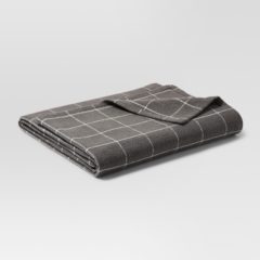
The houndstooth throw ordered from Target finally arrived. Its pop of black and white connect the guest room half of the room with the idea center and add another menswear touch.
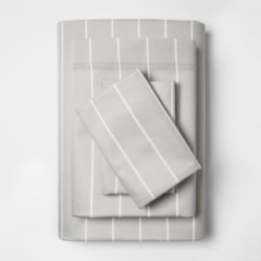
I ordered this blanket and these sheets from Target, too, but haven’t felt like changing the entire bed, which already HAS clean sheets on it, ready for the next guest.

So for now I arranged the charcoal windowpane-patterned blanket at the foot of the bed. I hadn’t decided on anything else for this spot, and I may just leave it as is, since Maisie-Cat obviously approves.

The two throw pillows came with our living room sofa but I’ve never used them. I like the print, but it’s lost on our charcoal gray sofa. They are PERFECT here, however, and that’s TWO MORE items taking up space in the coat closet put to use!!!


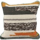

I ordered a third pillow to place between them, and the 2-by-3-foot rug will hang over the bed as part of another arrangement in process–both great boho touches!

I also decided the bedskirt needed a little something. Regimental stripes are a big deal in neckties, and Chris loves striped ties, so I thought a band or two of regimental striped ribbon would dress up the bedskirt edge.
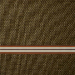
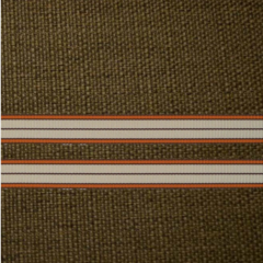
Easier said than done. After an exhaustive search, this is the ribbon I found and ordered on Etsy. It’s a half-inch wide, and I plan to apply it with Stitch-Witchery to get a smoother finish than sewing would allow. Do you like one band or two? I ordered enough for two, just in case and thought I could always use the extra for another project.
Snazzy either way, huh?
So now I’m just waiting for these new embellishments to arrive–tick tock…
Checking progress
Here’s how the updated checklist is filling out:

The room is looking better and better (even Chris says so!), and though spaces on the list are filling in I’m also thinking up new to-dos along the way and adding boxes. So the end is not yet in sight.
This is my list of upcoming projects, in the approximate order in which I’ll (we’ll) likely tackle them:
- Choosing and hanging art/decor on the wall between the closet doors and the hallway door
- Choosing and hanging art/decor over the bed
- Choosing/making an accent pillow for the chair
- New hardware for the desk drawers
- Choosing new or revamping existing storage accessories for the 1940s bookcase and the file cabinet
- Changing out the desk lamp
- File cabinet makeover
- Nightstand makeover
The nightstand comes last not only because it will be hardest, but also because I want everything else in place before I finalize specifics.
Whew! I may still be working on this come Father’s Day! Stay tuned for more inspiration, plans and results.
If you want more…

- While you’re waiting for the next post in this series, chart my progress by checking out the forerunners: Suit Up for Menswear Boho Chic x 12 (inspiration from Jan. 29), For My Valentine: ‘Mad Men’ Boho Chic – 1 (Feb. 12), For My Valentine: ‘Mad Men’ Boho Chic – 2 (Feb. 14), and Project 62 Tricks Out Boho Menswear Redo (Feb. 16).
- Browse Everything Don Draper has ever worn on Mad Men, season-by-season. courtesy of GQ.
- Go Mad Men shopping using the (affiliate) links here…