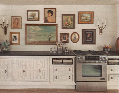
This kitchen reno caught my eye in the February 2016 Better Homes and Gardens. It wasn’t the cabinets made of repurposed 1980s-era furniture—although they’re innovative and look smashing. It was the wall of framed portraits and landscape paintings arranged above the counter. It looks so warm and interesting. Very boho, don’t you agree?
 |
| BHG |
The only issue I’d have with such an arrangement is that if you cook a lot (and we do), the paintings would pick up spattered grease and smoke residue, being that they’re so close to the cooktop. Proper ventilation helps, but I don’t see any here, unless it’s downdraft. Still, I like how it looks, particularly with the shiplap, sconces and stained wood countertops.
I don’t have room for a gallery wall in my kitchen, but I’ve been collecting items to make two in other parts of my condo. I want to add to one in my husband’s home office, which also serves as our guest room. And I want to replace a larger print in my office with a gallery of smaller items.
Seems like my home is heavy on single paintings and groupings of two or three, but nothing I’d call a gallery. I’d like to change that to add to the variety.
Gallery walls I added to my inspiration board:
 |
| Bolia via The Design Chaser |
I don’t have any corner this would work with, but thought I’d include it because maybe YOU do. The wrap-around adds motion and actually gets the viewer moving, too, to see what’s around that corner.
 |
| House Beautiful |
This arrangement reverses the previous one and utilizes an inner corner. The convergence of the different elements works so beautifully with the corner sofa and seems to invite you to sink right into its velvety luxuriousness. Don’t mind if I do!
 |
| Desire to Inspire |
These butterflies, though in different-sized frames, are arranged as if they were one, launching into flight. Enchanting!
 |
| Jeran McConnel |
I like how this gallery is even at the top, stepped along the sides and ragged at the bottom. See/read more of/about this home on Design Sponge.
 |
| Vosges Paris |
This one is the opposite: mostly even at the bottom and varied at the top. It’s nifty, too!
 |
| Via Little Green Notebook |
And this one is looser, surrounding the furniture on three sides.
A diagonal arrangement adds energy and interest in this space.
 |
| Decor8 via Domino |
Two paintings hardly constitute a gallery, but I included this photo because I liked the choice of paintings. I love puns—both verbal and visual—and chuckle every time I see this woman with a grocery bag over her head next to the woman with the wildly similar headscarf.
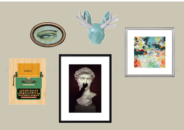
Collected so far for my office wall…
My actual frames are different on the two larger pictures. “Lunar Freefall,” on the right, is framed in black and “Knuba,” lower center, is framed in gold. The “hello!” typewriter comes unframed (currently on order), but I may frame it after it arrives. I definitely think I need some other pieces for this wall but not sure what.
Here are a few famous paintings I like and thought I might work in smallish prints of some:
Now that I see them nearer to what I already have, I think the Brauner (far right) definitely, in a mid-size. Both the Murillo and the Sargent share the elements of sight and scent with “Knuba,” so might work if smaller and framed just right. I like the idea of the Dali—looking out an open window at the sea suggests such possibility, which is how I want to feel when I’m at work. And the Picasso, well, that’s just who I am (clothed, of course).
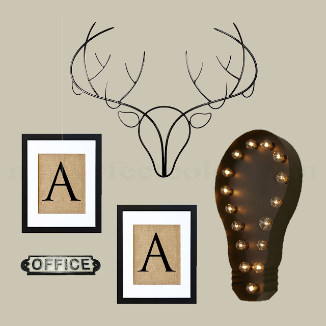
Collected for Chris’ office…
Please note that HIS monogram prints are L and C, and the only picture I could find of the light bulb is at an angle, so it looks a little skewed here. I also have three clip-on bowties Chris wore when he was a little boy, and I want to mount them together in a shadowbox.
I’m shooting for an industrial vibe. Not sure what else to add, but I have LOTS of room to add.
What do you all think about either arrangement?
I know they tell you to cut out shapes and arrange those. I did that and thought I had it right, but wasn’t pleased and kept fiddling.
Any input is welcome.


