
I’ve spent the last six weeks or so drooling over this edgy, slightly boho, warm and homey Manhattan apartment by designer Rayman Boozer of Apartment 48. You can probably see the drip marks on the photos—my bad!
 |
 |
| David Land/BHG |
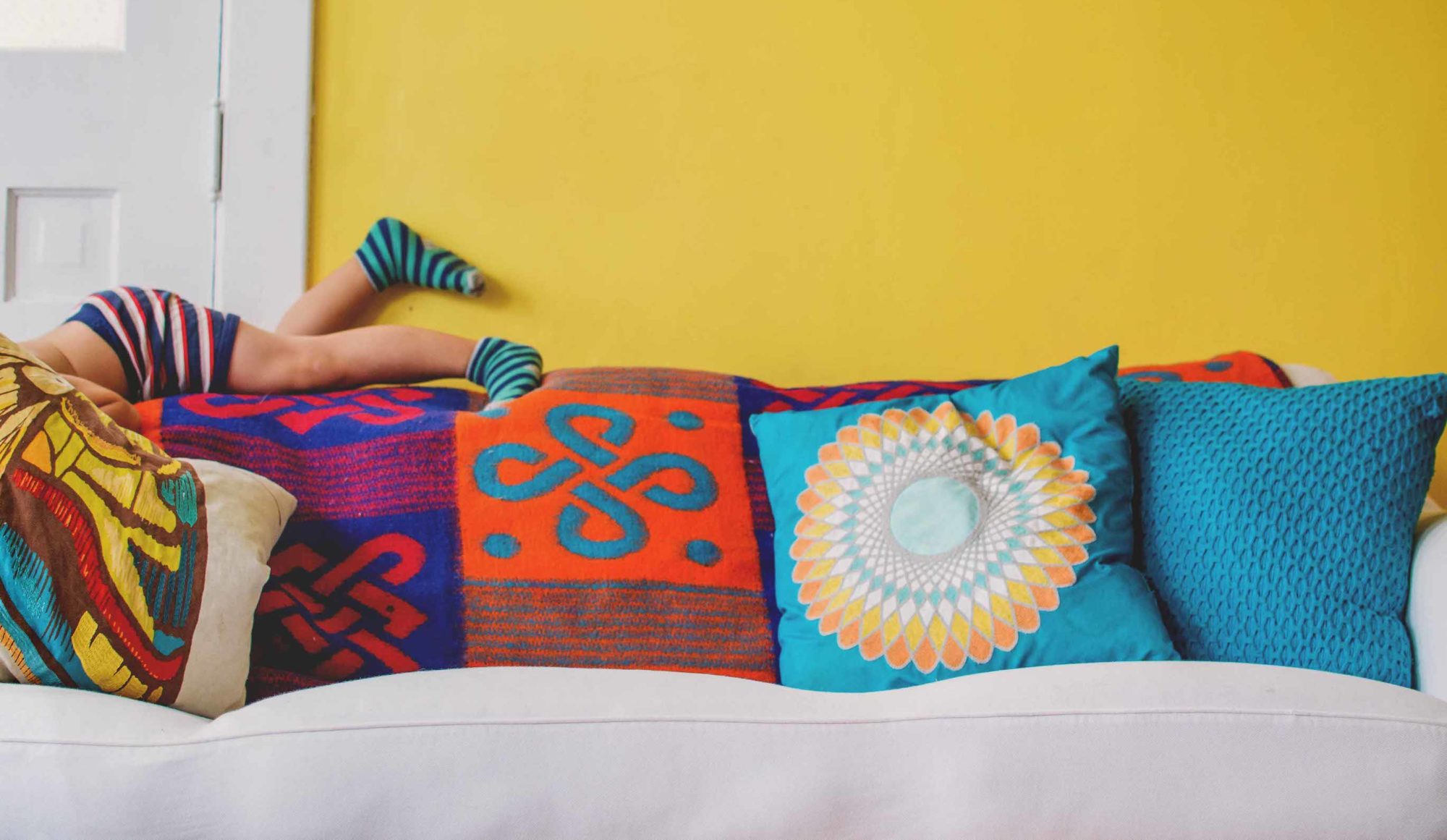
“The day I met her she was wearing a really vibrant dress,” Boozer says. Even so, owner Kimberly Snead was skeptical those colors would also work in her home. “Once I explained to her that purple, yellow and orange were colors she naturally gravitates to, it helped her realize this palette was for her. They’re happy colors that make you feel good.”
They certainly make ME feel good. I like how the room is feminine and elegant at the same time it’s bright, bold and just a little bit boho.
|
| David Land/BHG |
 |
| David Land/BHG |
Those same bookcases hold memorabilia from the owner’s travels—items packed away until Boozer’s deft hands styled them to tell the owner’s story. To add a bit of extra drama, Boozer painted the foyer (right) a gorgeous marine blue, pulled from the painting between the bookcases.
My favorite part of this vignette, however, is the lime green goose nesting under the aqua demilune foyer table. Now that’s dramatic!
 |
| David Land/BHG |

Boozer heartily recommends the fashion approach to interior decorating. “Most people will take more chances with fashion and avoid color at home,” he explains. “Think of your room the same way you would an outfit: The color of your pants or skirt might be a rug or sofa or other large piece. Your blouse is a side chair or wall shade. And that fabulous statement necklace is the boldly painted chest or ottoman.”
So the next time you’re putting together a mood board for a redo, start looking for inspiration in your closet and jewelry box. What makes you feel good to wear? What are you wearing when people compliment you on how you look? Make a mental note, then surround yourself at home with those very same colors, textures and patterns.