
Of the eight palettes Pantone released with its 2016 colors of the years, only one—palette #7—lacks a traditional neutral. That’s right: no shade of white, brown or black anywhere to be found, which makes it a bit tough to find rooms to illustrate it.
Here’s what it does have:
- TWO shades of pink (Rose Quartz and Scallop Shell)
- Two shades of purple (Grapeade and Lavender Fog)
- One of only three palettes with an orange tone (Peach Quartz)
- One of only three palettes with a green (Smoke Green)
What we’re left with is a more ethereal palette than the others, largely pastel but sunny, something I like to call “the sweet shop” for its candy-like, cheerful values and color names. But how does that look in a room?
I’ve read lots of complaints about this year’s color choices being too feminine and not suitable outside a nursery or child’s bedroom, and I think that’s a superficial criticism. Most of what’s been blogged about the colors concentrate only on the two key tones and don’t even consider them as part of a larger palette.
Sure, some people will decorate a whole room in one color (if they really love it) or use it to accent a neutral plane. But most of us decorate in palettes—collections of color—where the colors of the year, Rose Quartz and Serenity—may be dominant or only add a subtle flourish to the mix. You don’t have to have an all pink and blue room, or even mostly pink or mostly blue. Use your imagination, folks!!
Though I tend toward more saturated hues all-around, I could be happy in any of these rooms. They certainly give me ideas about how to put all colors to greater use, which is, I’m guessing, a big part of what Pantone hopes to achieve with its promotional programs.
So come visit the “sweet shop” with me—the last of my eight posts in this series—and have a taste of whatever looks extra yummy to you!
Peach melba parfait
 |
|
Victoria Pearson
|

All the colors used in this dining room come out of the abstract painting on the right. Suddenly I’m craving peach ice cream and raspberry and lime sherbet! Note how the pale green area rug acts as a neutral in the space and softens the pinks.
I’ll have a grape Nehi, please


Remember how Radar on M.A.S.H. always drank grape Nehi? Remember grape Nehi? I do. It was the color of this sofa—Grapeade. I love the large-scale botanical chintz fabric on the sofa set against the lighter, Lavender Fog wall.
Strawberry shortcake, Asian style
 |
| Angie Hranowsky via My Domaine |
The oriental artwork, Moroccan table, exotic textiles and Asian rattan chair and ceiling light fixture add weight to this whimsical pink sofa. The peachy Roman shades are almost, but not quite, brown and pick up on the rug’s sunny border strip.
Follow the link to see more of designer Angie Hranowsky‘s interiors.
Once in a blue moon
 |
| Collins Interiors via House of Turquoise |
If you’ve spent any time in the upper Midwest, you’ve encountered blue moon ice cream. The Chicago Tribune describes it as “Smurf-blue, marshmallow-sweet, and tasting remarkably like Froot Loops and Fruity Pebbles,” which could also describes this living room.
The sweet cereal flavors show up in the colors of the abstract painting, but the room has a super-cool, sophisticated vibe. See/read more about this house at designer Cynthia Collins‘ website.
Old-fashioned peppermint stick

I always await Christmas season and the appearance of peppermint-crunch ice cream. If my living room looked like this, I could get my fix year-round. I love the casual, wrinkled look of the pink sofa’s linen slipcover, as well as the mix of print and solid-color pillows.
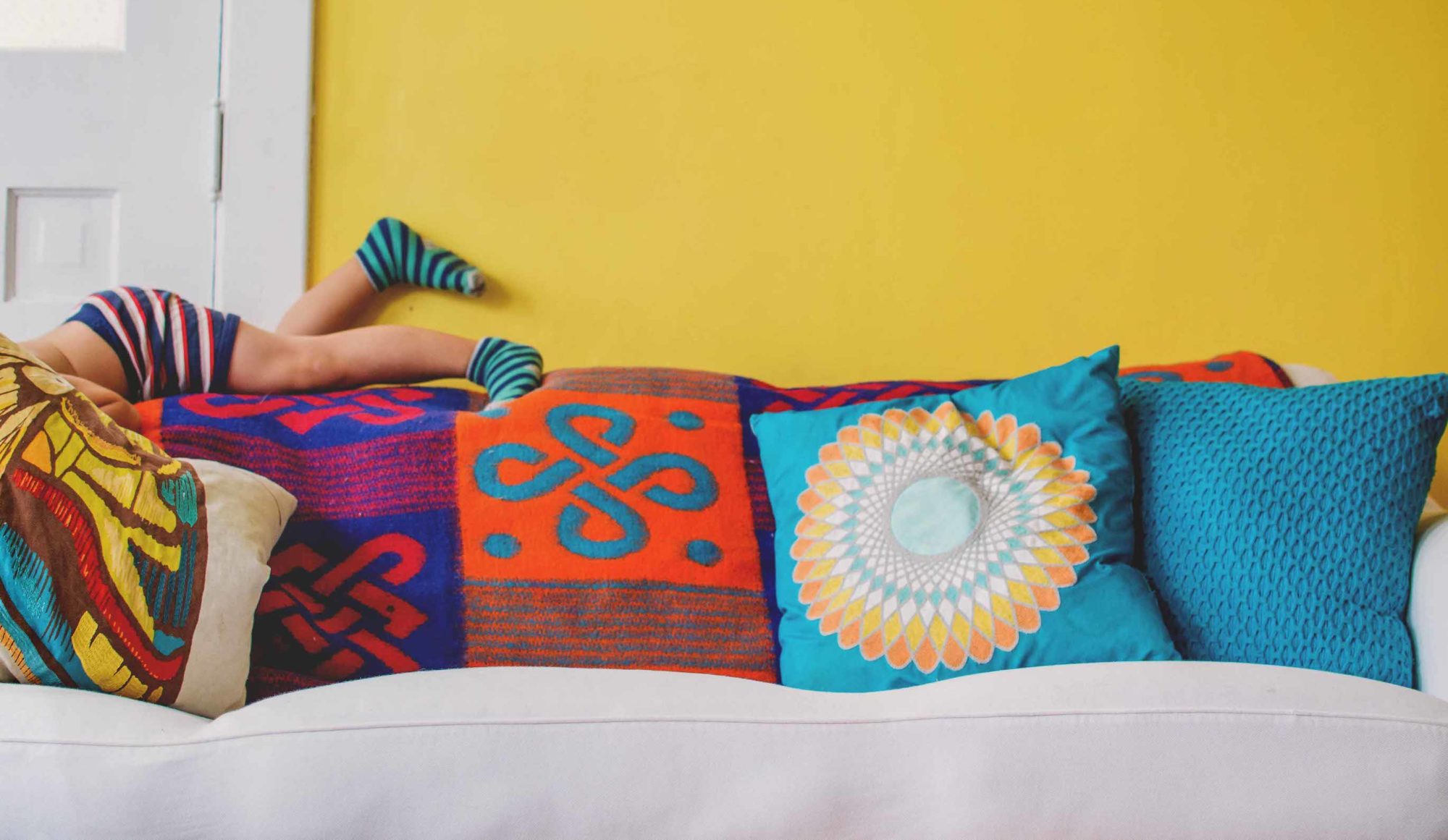
Tutti Frutti: wop bop a loo bop a lop bom bom!

Little Richard never had it this good, whether he was out with Sue who knew what to do or Daisy who drove him crazy.
Forgive me for saying, I told you so, but...
Not one of these rooms resembles a nursery. Not one is overly feminine.