A lawyer named Butterick is attempting to clean up graphic design abuse in his profession with a book called Typography for Lawyers. It’s been so popular that he wrote a companion version for the rest of us: Butterick’s Practical Typography.
While I’m not wrapped as tight over typography as Matthew Butterick (and I can’t get over how his surname makes me want to buy some gabardine at Jo-Ann’s and stitch up an A-line skirt), I laud the intentions he shared in an interview in Quartz.
Why does typography matter?

I heard this in every journalism class I ever took. I don’t think Matthew Butterick, Esq., was in any of them (neither were most of the world’s 8 million bloggers), so I don’t know where he picked it up, but he’s right on:
Typography matters because it helps conserve the most valuable resource you have as a writer—reader attention. I believe that most readers are looking for reasons to stop reading. By spending time to finesse the layout of a document, a writer can eliminate distractions so readers can actually focus on content.
YES!!
I read a LOT of blogs, trolling for inspiration for my own (this one here that you’re reading), and I spend too much of that time fighting poor formatting choices and lazy grammar. (I don’t like to play the journalism-degree/former-English-teacher card, but I am qualified to bitch about this.)
I know blogs are supposed to be conversational, to reflect the blogger’s unique voice and sensibility, to be relaxed and laid-back, and I wouldn’t change all that. But I wonder if some bloggers (and on-line magazines!) understand how tough their posts are to read just because of a few silly things they do and don’t do. Apparently not everyone agrees with me because the blogs that annoy me most have way more readers than mine and a string of awards, though obviously not from the Modern Language Association or the American Society of News Editors.
But because these bloggers and publications have big shoulders and influence so many, it’s time they clean up their acts. I won’t call out any specifically, but you’ll know who you are based on my gripes. (That is, if they’re reading ME.)
Please STOP:
- Centering ALL body text. It’s hard to read, and it doesn’t look cute. I can tolerate centered headlines (sometimes) and centered photo credits/captions, as long as they’re confined to one line. But I prefer flush right photo credits and flush left for anything longer than one line because that’s where folks in a western society look for the beginning. When the lefthand margins are uneven, we lose our place.
- Flouting standard rules of capitalization. it isn’t cute to begin a sentence with a lowercase letter. it makes you look like you’re in junior high, writing notes to your bff. next thing you know you’ll be using a font that dots the lowercase “i” with a heart. puh-LEEZ.
- Italicizing lots of text. It’s also hard to read in bulk. It’s okay for emphasis (that means occasionally), for variation in headlines, for pull-out quotes.
- Capitalizing lots of text. HARD TO READ AGAIN. OKAY FOR EMPHASIS AND FOR LABELS (LIKE IN A TABLE OR CHART).
- Formatting large blocks of text in reverse type on a dark background. This is okay once in a while, in small quantities. But as standard style, it’s tough to read, too.

Please START:
- Letting your layout breathe. Blank space is also a design element. It’s called “negative space,” and you should learn to use it to help the reader hang in there. If a page breathes, the reader will tire less and comprehend more.
- Being consistent in your use of white space. It makes a difference. For example, I always use…
- 1 line of blank space between a headline and body text below it.
- 1 line between paragraphs
- 1 line between a photo and the text that follows it
- 2 lines of blank space between a paragraph and the photo below it
- 2 lines of blank space between the end of one section and the head/subhead for the next section
- Breaking up your writing into smaller paragraphs. Forget what your English teachers told you about well-developed paragraphs. Paragraphs on a typeset page (paper or electronic) are rest stops for a reader’s eyes. Whether you indent or skip lines between, try to limit paragraphs to 1-3 sentences. Study your page in preview mode and break up any text blocks that look forbidding.
- Learning the correct use of common homophones, or else generate your posts in software that prompts you when you get it wrong (like MS Word). Start with it’s/its, you’re/your and they’re/their/there. Once you have those mastered, work on then/than, to/too/two, here/hear, lose/loose, are/our, and who’s/whose. I’ll let you look up correct usage yourself so (maybe) you’ll finally remember and your fourth-grade teacher can stop spinning in her grave.
Whew! Now that I’ve got that off my chest, let’s redefine beauty
You won’t want to miss this compelling interview with plus-size model Tess Holliday in Paper. Holliday is the industry’s first size 22 model, a fashion designer, and the creative energy behind #EffYourBeautyStandards, which you’ll also want to check out.
 |
| Catherine Harbour |
My favorite Tess quote:
There are so many people who think that being a plus-size model, that there’s something wrong with it, or that I must be unhealthy or that I’m promoting an unhealthy lifestyle. And at first it was very hard, and I blamed it on myself, and then I thought…my health is none of their business, I’m modeling for this clothing company, so why are people dissecting my body and telling me that I can’t wear some things? That I can’t look a certain way because of my body? And I did combat that for a while, and argue with people about that, but ultimately it’s kind of like banging your head into a brick wall. If people are committed to that theory, I’m not going to change their mind. But there are people who look like me, and feel like me, who feel like they don’t have a voice, and that encouraged me to keep going.
As a plus-size woman, I can confirm how frustrating it is to shop for clothes modeled on diminutive women. I need to see how something looks on someone more like me, so thank you, Tess.
Paper devoted the last week of its January health and wellness emphasis to the plus-size industry. Follow links to read interviews with plus models Anita Marshall and Bishamber Das.
And let’s take on gender, while we’re at it
 |
| Victor Boyko |
And a few of the outfits shown for men made girly-me drool with envy…
 |
| Victor Boyko/Catwalking/Ernesto Ruscio/Victor Boyko |
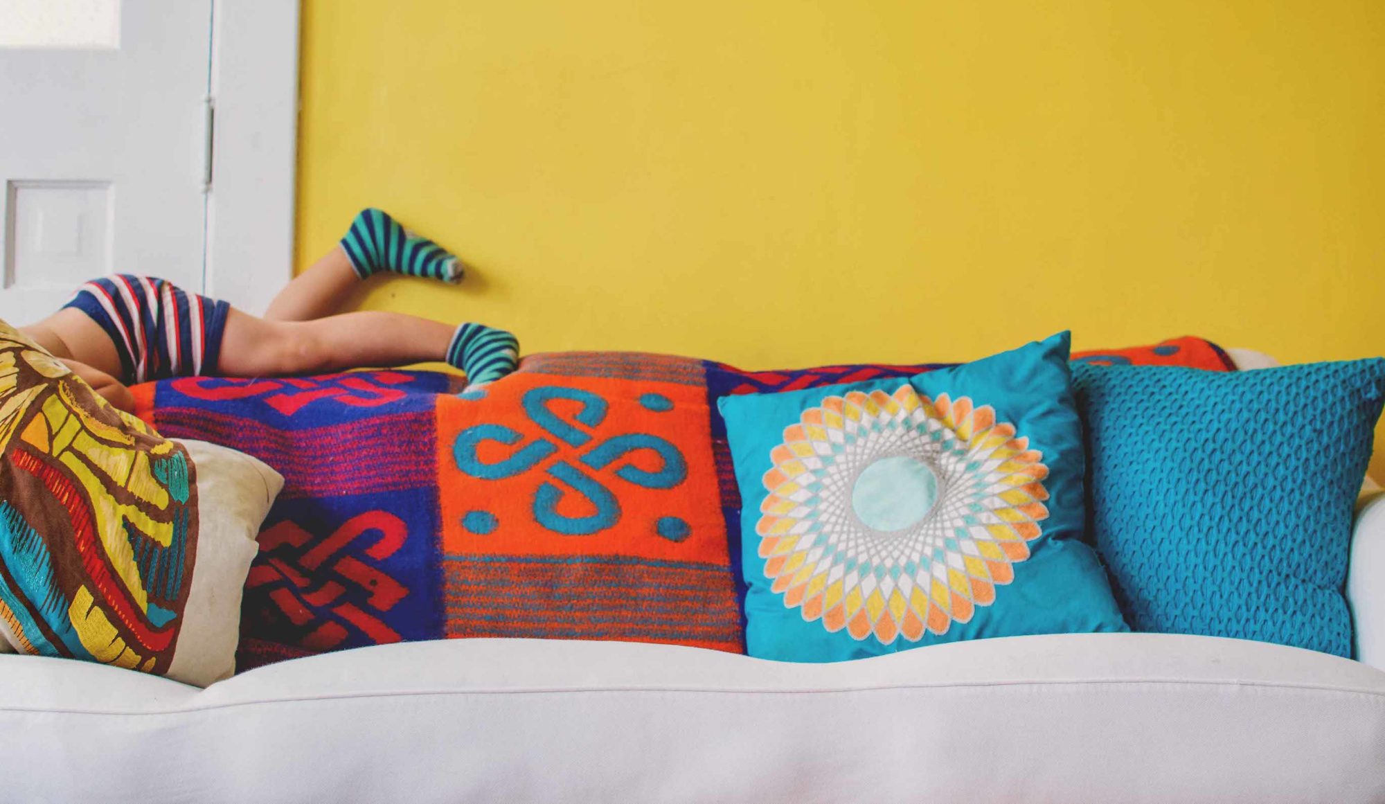
The yellow Fendi fur I didn’t really want to WEAR so much as make into pillows for my sofa (see Call Me Mellow Yellow).
I understand why men finally want to wear prettier clothes, and I don’t begrudge them their forays into the feminine. I am, however, impatient for the clothing industry to start making women’s clothes just as durable and as functional as men’s without costing 10 times as much. Translation: Plus-size bottoms (of all sorts) that don’t fall apart in a few weeks, and please, more pockets on everything.
Ladies, do you agree?
File under ‘Just when you thought it couldn’t get any weirder’
A UK firm has devised a new way to separate expectant parents from money they should be saving for their kids’ college: 3D-printed renderings of unborn children.
 |
| Mirror.co.uk |
A scary company (appropriately named Baby BOO) uses ultrasound images and a 3D printer to produce eight-inch replica masks, which they then frame for parents-to-be to hang on their walls and creep out all their friends. Marketing materials tout the early-bonding opportunity the masks present, especially for the blind, who will now be able to “see” their baby’s face through touch much sooner.
Except it’s a not fully distinct face. And it’s creepy. Did I say that already? It’s worth repeating. CREEPY.
Hmmm. Reminds me of the ancient Romans, who were famous for death masks. Important families collected these wax castes down through the generations and hung them on the walls of their atriums (compare to modern-day foyers) to impress visitors. Then when a male in the family died, all the others marched in the funeral procession wearing an ancestor’s mask. I’m still wondering how the masks managed not to melt (a.) in the hot Italian summers before air-conditioning, and (b.) alongside the customary blazing funeral pyres.
So, in a creepier still reverse ritual, will older children in “Baby Boo” families wear “their” masks at the birth of future siblings? Or go on family trick-or-treat outings where all the kids dress as their fetus self?
I repeat, CREEPY.
File under ‘Not as creepy, but twice as useless’
These floating bonsai are part of a Kickstarter project to bring some “anime magic” to your home. Though the project is well past its $80,000 goal, you still have about a month to become a backer at the $200 level and get the full package of plant, moss ball, pot and energy base with magnet, rotating mechanism and AC adapter.
If you’re feeling particularly generous, there’s still one open position for a $10,000 backer. For that you get an all-expense-paid trip to and tour of the Air Bonsai Garden factory in Japan. Woopee.
At this writing, the project was nearing the $500,000 mark on Kickstarter, which leaves me wondering how so many people have so much to spend on stupid stuff when I’m obsessing over a MERE $85 to buy a furry yellow pillow I want.
Read more about the Air Bonsai “Little Star” on Wired.
It’s a dog’s life #1: Meet the Bergamasco
 |
| Jamie McCarthy |
When Madison Square Garden opens its doors for the 140th Westminster Kennel Club Feb. 15, seven new dog breeds will be certified to compete, including the Bergamasco, shown here.
An Italian herding dog, the Bergamasco’s coat is comprised of three types of hair, which form flocks, or loose mats, and protect the dog from weather and predators. These flocks, when trimmed back, will grow all the way to the ground each year.
Sweet as he (she?) is, it’s hard to tell whether that’s its real coat or this dog is wearing a mop, but I guess the judges can sort it out.
A mop or a chenille-shag pillow. Dragged through mud puddles.
Did someone say its name was “Bullion Fringe”?
Dye this little guy (or gal) yellow and it would solve my living-room-accent-pillow dilemma.
You know I’m kidding, right? I’m sure this one has a sweet face, too, if only we could see it. Follow this link to see all the new breeds.
It’s a dog’s life #2: Ludivine takes 7th place in the race but 1st in our hearts
This is the stuff that children’s storybooks, cartoons, and stuffed toys are made of. And if you haven’t heard of the two-year-old bloodhound named Ludivine who placed seventh in an Alabama mini-marathon, just look her up on the Internet, where she’s already legendary.
 |
| Jake Armstrong/April Hamlin |
Owner April Hamlin wasn’t surprised her buddy once again escaped her pen for a stroll around the small town of Elkmont (where most everyone knows her), but she was surprised Ludi ran all 13.1 miles of the race, “because she’s usually really lazy,” Hamlin said.
Lazy or not, Ludivine (who wasn’t registered to run) got curious when she saw all the people gathered. So when the starting shot fired, she took off alongside the 165 other runners. And she might have beaten the winner’s 1:19 finishing time, if she hadn’t taken time to do the dog’s version of “stop and smell the roses.” Another runner who paced her most of the way said she detoured to sniff a dead rabbit, romp in water, greet another dog watching the race, and visit some cows and a mule in an adjacent farm field. She reportedly finished somewhere around 1:30, and was the highest-placing FEMALE.
Money raised from the race will benefit the Elkmont High School cross country and track and field programs. No word yet on whether Ludivine has been offered an assistant coaching position with those teams, but the January 2017 race has already been renamed “The Elkmont Hound Dog Half,” and a new logo features the town’s favorite sniffer.
That’s a full lid! Enjoy your weekend.
XO,
Susan