
When Pantone revealed its 2016 color of the year was actually TWO colors—Rose Quartz and Serenity—it emphasized the importance of where those two tones meet and mingle. You only have to take a look at a sunset to see that at the intersection of pink and blue is PURPLE in its many shades of lushness.
Three of the eight palettes Pantone released for 2016 include shades of purple, and two of those pair purple with green. But only one—palette #1—includes two shades of purple and two of green for our mixing pleasure.
See if you don’t agree.
Under the sea
 |
| Indulgy |

This photo goes in an inspiration file for the redo of my own master bedroom. I love its deep purple walls paired with the tropical print of the draperies and accent pillows. When you factor in the undersea artwork, it feels a little like deep-sea diving along a coral reef—not a bad way to wind down and relax at the end of a rough day! Serenity shows up in the striped bedskirt, while Rose Quartz is more subtle still, in the shadings of the art.
Midnight melodrama
 |
| Koket |

Rose Quartz and Serenity are more subtle still in this living room. Note the pink in the flowers and in the background of the painting, and the blues in the geode, book covers and pillow print—mere punctuation marks against the wall of Volcanic Glass and the dramatically curved Fig sofa.
New Year’s Eve in this room would mean champagne in Baccarat flutes and caviar, don’t you think? I’m free, and if I wasn’t I’d rearrange my schedule.
At the crossroads of color and utility
 |
| Vintage Revivals |
This space wears only a suggestion of purple in the print of the one patterned pillow, while Thyme takes center stage as upholstery on the loveseat. Pinks are sketchy, too, but the blue in the area rug acts as the anchor that pulls all the elements together.
Mirror-mirror on the mirror
 |
| Bjorn Wallander |
Fig and Thyme play heavily in the bird prints in this Chinoiserie-style dining room designed by T. Keller Donovan. Rose Quartz makes a splash in the ikat-patterned, floor-length tablecloth, while Serenity hangs out with the purples and greens in the prints and the mirrored wall reflects all the lush color beauty.
I’m usually not one for mirrored walls—particularly in dining rooms. After all, who wants to sit and watch themselves (or their guests) eat? But this one is tempered by the buffet, lamps, Majolica display and the layering of mirrors—one above the buffet, as well as its mirrored doors. See/read more about this Palm Beach apartment at House Beautiful.
Eternal spring
 |
| El Mueble via House of Turquoise |
Orchid Haze takes center stage in this bedroom via the coverlet. I love how the pale blue, mid-scale drapery print dissolves into the pale green, small-scale wallpaper print. I wouldn’t have thought to pair either with the other and then with the purple bedding, but OH MY does it work! I also like how the architectural interest added by the picture rail stops the wallpaper but the curtain rods break that dividing line.
What’s the Victor Hugo quote? “Winter is on my head, but eternal spring is in my heart.” He must have woke up in this bed in this bedroom. Maybe even in this house? See/read more about the English country home this bedroom is a part of at El Mueble.
Midcentury marvel
 |
| Nat Rea |
Two sides of the same living room add up to one sophisticated midcentury space. I love how the Thyme of the draperies repeats in the medallions of the Serenity blue area rug. And the pink lumbar cushions add depth as well as comfort to the Fig club chairs. Classy! See/read more about this Boston brownstone redo at Rachel Reider Interiors.
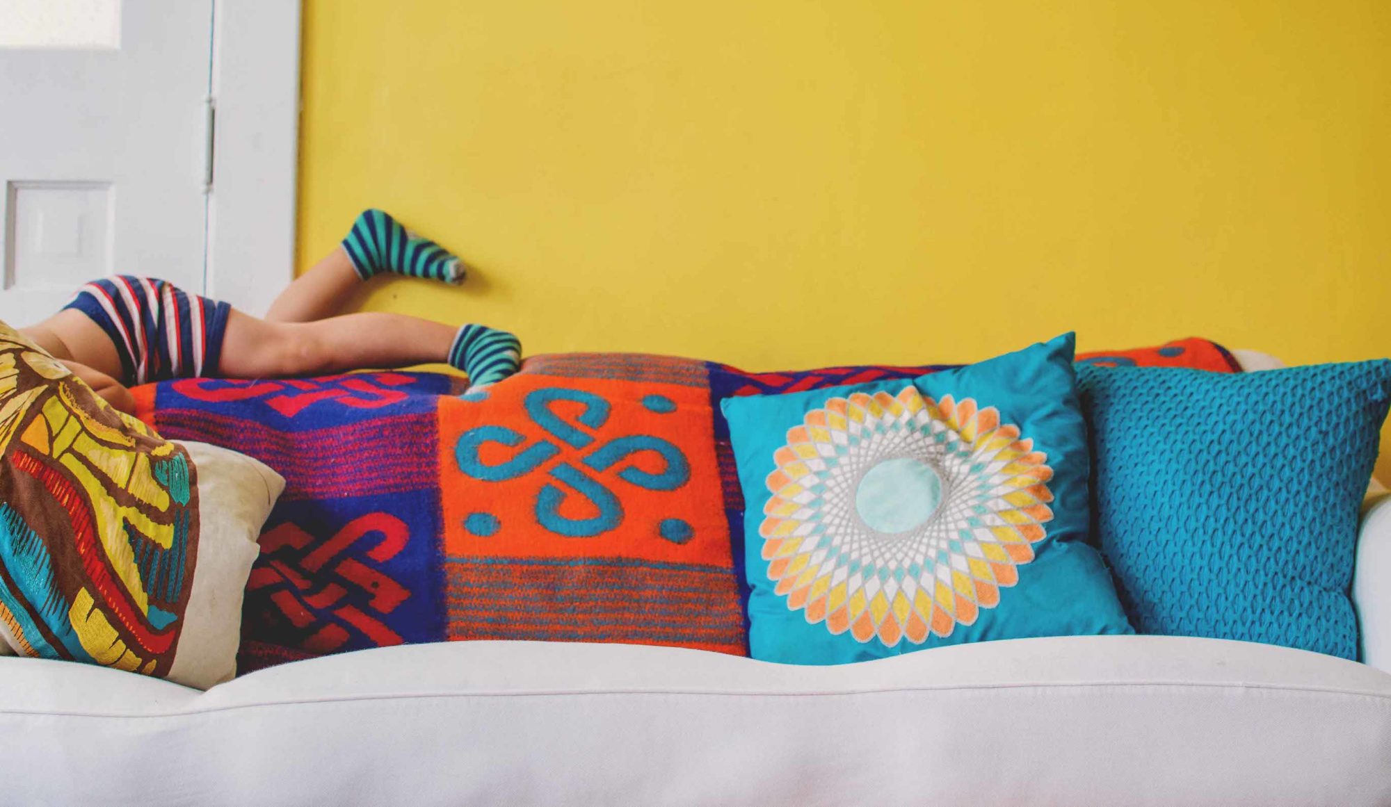
Bohemian dream

Follow the link to see all of Pantone’s 2016 palettes that use colors of the year Rose Quartz and Serenity, as well as to learn about the intelligence behind the choices, and follow my blog with Bloglovin.