 This post is second in a series on Pantone palettes for designing with 2016 colors of the year Rose Quartz and Serenity. Monday I shared examples of palette #8, and today’s post features palette #2.
- the inclusion of both beige and gray hues
- a darker neutral called Major Brown that can read “General Charcoal”
- a luscious raspberry hue called Nostalgia Rose that leans toward lilac
The impact of the colors together is reminiscent of a stroll through a garden in full bloom, probably in mid-May and just after a brief, rejuvenating shower. The deeper pink value enlivens the palette, and the array of neutrals adds shadow and depth.
See what you think.
Take a Tuileries Promenade
 |
| Back to the Wall |
A floral wall mural makes this midcentury living room sing with all the sophistication of a a Paris pied a terre. Tones of Vetiver play in the draperies and area rug, while Major Brown grounds the space just as a fine wrought iron fence or trellisworks would.
I like the pairing of a floral on the wall with a geometric on the floor and a low-backed sofa with a high-backed wing chair. The clean lines and solid colors in the furniture make a simple yet emphatic statement without competing with the gorgeous mural.
Ride on the Marrakech Express
Find an English Country Hideaway
The inclusion of Cream Gold in this palette is like a burst of sunshine, and no room I found illustrated that better than this one. I like the textural patterns used for upholstery—tone-on-tone chevrons on the chair and blue-on-white damask on the Chippendale sofa.
Additional white touches in the room’s “bones”—the elaborate mouldings, wainscoting, window muntins—are reinforced by the white accessories—the Moroccan coffee table, lamp, and marble top of the dresser—so that the pink walls are neither overpowered nor overpowering. The seagrass carpet in Starfish tones, as well as the overstuffed seating and plump pillows, lend a comfy, relaxed look to what could have been a stiff and formal space.
Curl Up With a Good Book
I love how the gorgeous blue sofa makes all of the same-colored books stand out. As if that wasn’t enough to make me adore this room, there’s that wonderful faded Persian carpet in ethereal shades of rose and blue that seems to illuminate the space.
I’m guessing the books have been arranged somewhat by the color of their bindings, but not so much that it looks over-styled. Those jeweltone Roman shades are to die for, and the lumbar pillow in the same shade as the borders is just the right touch. There’s nothing here NOT to love, which is to say it all works and how! Wow!!
Pick a Bright Bouquet
 |
| Sharyn Cairns |
I’m not sure why two similarly scaled but very different floral prints manage to work together here, but I’m guessing it has something to do with the shared use of pink and yellow. Yellow sunflowers in the small painting and bright pink cosmos in the vase reinforce the variety found in a cutting garden. The midscale-print coverlet and the mini-check pillows work like a good groundcover to connect all the flower dots. This photo appeared in Absolutely Beautiful Things by Anna Spiro.
Hit that Blue Note
 |
| David Tsay |
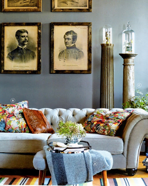
Most of the spaces we’ve seen lean more on Rose Quartz than Serenity, but this photo turns the tables. The walls seem to combine Serenity and Vetiver to achieve a velvety hue, while the sofa, stool and throw are blue, blue and blue. I found a tiny touch of pink in the tray and throw pillows, as well as a Nostalgia Rose stripe running through the Dhurrie rug. How about you? This room appeared in Styled by Emily Henderson.
Cultivate a Secret Garden
 |
| Caitlin Wilson via Centsational Girl |
If 2016’s colors are all about serenity and retreat, then this room hits the mark. What young girl wouldn’t like to approach her tween and teen years with this safe haven to return to?
I love the pink piping on the chairs and the blue banding on the bedding, to say nothing of that wild and glorious floral upholstering the bed. There’s an en suite bathroom with that same print on the walls, if you just can’t seem to get enough of it (like me). More photos and the full story can be found at designer Caitlin Wilson’s blog.
Retreat to a Seaside Cottage
 |
| Mikkel Vang/House Beautiful |
Pink is a color commonly found in seashells, and that’s what these walls remind me of. The seahorses and mermaids dancing across the chimney chase give this room a coastal theme, but the cozy florals, books and scalloped shelves say cottage retreat to me. I love the fans in vases flanking the fireplace. Not sure if they’re a variety of coral or shell or simply paper, but their curves soften the hard lines of the fireplace.


