
“How wonderful yellow is! It stands for the sun.”
-Vincent Van Gogh
Maybe Van Gogh isn’t the best poster child for yellow, or maybe he would have painted less and died sooner without it and we’d have fewer of his swirling canvases to drool over.
All I know for sure is, it’s a cold, windy, gray, snowy January day, and just looking at yellow makes my boho heart feel warmer and more energetic.
For me, little pops of yellow do the trick in my own boho home: a furry accent pillow, swirls of color in an abstract painting, a single flower in a bud vase. It’s not a color I typically decorate with or wear, but a closer look at these high-yellow-factor rooms just may change my mind.
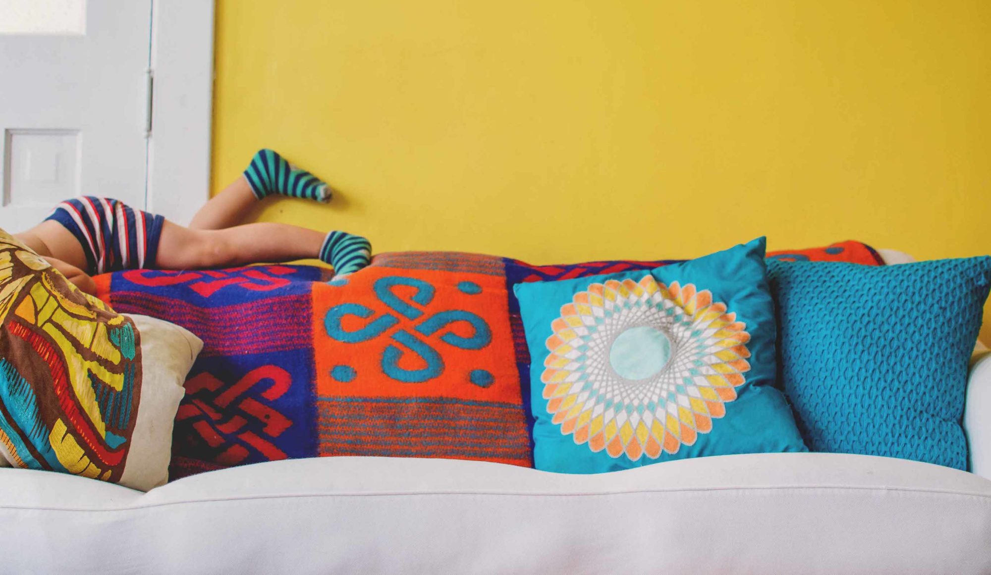
Sleep tight, sleep bright
 |
| Via Digs Digs |
I smile every time I see this bedroom photo. The artwork has so many bright, beautiful colors in it that it would be simple to change out accessories with the seasons: yellow in winter to make you feel warm and sunny when it’s dreary outside, green in spring, blue in summer to cool things down, red in autumn. The white walls and bedding help the yellow pop, as well as give the eye a less intense place to rest.
Depending on your yellow tolerance (because, let’s admit, it can overwhelm), this room shows lots of options for adding yellow, or not. Maybe just what’s in the painting is enough for you. Choose how high you want to dial your yellow by changing out other accessories—pillows, throw, lamp, etc.
 |
| Elle Decor via Chinoiserie Chic |
Yellow paired with blue is one of my favorite combinations. My absolutely favorite bouquet is sunflowers paired with deep blue/purple Dutch iris. In this guest room of textile designer Susan Harris’ Connecticut home overlooking Long Island Sound, the blue is lighter and softer, and the yellow is more of a maize. The iris blue is there in the painting over the chest of drawers, though. The yellow-and-white-striped rug works so beautifully with the yellow, white and blue stripe of the bedding. And notice that the stripes seem to echo the lines of the painting.
 |
| BHG |
Gray and yellow is one of those classic combinations, with a preppy or military look (think Confederate uniforms). Here, only a portion of the wall above the bed is yellow to simulate a headboard. I love the yellow plaid curtains paired with a gray plaid area rug, then accented by that wonderful ikat dotted bolster pillow. See before and after photos of this bedroom makeover at Better Homes and Gardens.
 |
| BHG |
Yellow wallpaper is a more permanent choice, but the pattern and hue used here are easy on the eyes, leaning more golden than neon. I’m always a sucker for toile, and the pleated trim in these euro shams make them that much sweeter. The maroon tray hung on the wall brings the yellow volume down a tad. But my favorite part of this vignette is the pop of yellow accessories on the bed table—a bowl, a box, a book. Stunning!
Off the wall, on the wall

Not sure you’re ready to commit to yellow walls? Try a creamy yellow, which, to me, is neutral with a zip. I love how it works in this room with the more intense chartreuse accents.
In my previous home we used a Sherwin Williams’ color called Candleglow in several rooms, and it lived up to its name. I lost count of how many people asked me what that color was. And I remember the construction workers who built the house sneering while it was being applied (as if to say, This lady is crazy!) only to ooh and aah after the white trim went on and the cocoa-colored carpet was laid.
 |
| BHG |
These walls are just a smidge more intense, and the sofa is about the color of the carpet I had in my previous home, so you can see how well the two colors work together. This homeowner saved the really intense yellows for accessories—the lamp, the pillows, the pot. My favorite part is the yellow mix in the picture mats. With both the blue and the white, plus simple white matching frames, this gallery wall takes on the grid look of a Mondrian painting.
 |
| Apartment Therapy |
If you’re up for the full press, take a cue from this gutsy Chicago resident, who likes jewel tones. Must be the lake effect weather taking its toll, huh? Citrine walls aren’t for the faint-hearted, but then maybe they’re a personal energy source. Think of it: walls this color are like owning your very own sun! See/read more about this home at Apartment Therapy.
Knock-knock knock-outs
 |
| Left: Old Brand New. Right: Elle Norway |
Not willing to commit to yellow on the walls? Try it on just a door or two. In gardening, I was taught to use yellow sparingly because of its power. Where it worked best was at the end of a path, to draw the eye and encourage exploration. On these doors, it works the same way, leading you outside or to the next room. See/read about the room makeover on the left at Old Brand New.
 |
| A Beautiful Mess |
This diagonally painted door becomes an art installation, repeating the angles in the throw pillow. If your doors are already white, your paint job is already half done. You’ll find a full tutorial to get this look on A Beautiful Mess. Don’t like it when you’re finished? Repainting a door is easier than a wall, and repainting half a door is easier still. But my guess is you’ll LOVE it.
Cover-to-cover recovery
 |
| Left: Via Dwellings Design. Right: Via Living Room A. |
A yellow sofa is a big commitment, but isn’t it brilliant paired with gray and black (left) and orchid and black (right)? Notice how the letter-shaped shelves in the room on the left are mostly backed in yellow; I love how all the accessories pop in this one, and that area rug is to-die-for.
In the room on the right, I like the mix of black-and-white zebra stripes in the rug with traditional stripes in the pillows, and the checkered boxes. Purple is opposite the color wheel from yellow and so considered its ideal complement.
 |
| Left: Aurelien Brion via Home Designing. Right: Source unknown. |
But if the idea of committing to something as expensive and permanent as a sofa in yellow scares you, opt for an accent chair, like the midcentury modern wing chair on the left, or two matching chairs, as in the room on the right. Both are built around that stunning gray and yellow palette, and think of all the terrific yellow flowers you can find year-round to use as an accent.
Sneak up on it
 |
| Left: DENY Designs. Right: Michel Johner via Decorology |
Start with small pops of yellow—a throw pillow, a vase, a lamp shade, flowers—and work up your courage. Take note of how it affects your mood, particularly if it’s cold and dreary outdoors.
 |
| Left: Inside Out. Right: Sunset |
Now up the ante and switch out a lamp, a book, a table or two.
 |
| Left: Source unknown. Right: Southern Living |
Art is a great way to try a bold color on for size, too. We expect art to be colorful, right? I can’t think of anything that would lift my spirits much more than soaking in this tub and staring up at that colorful woodland painting, can you? Follow the links to see/read more about the Southern Living idea house and its interior designer Bunny Williams.
Switchback reverse
 |
| Left: Home Edit. Right: Bossy Color |
These rooms are virtual opposites. In the one on the left, a neon yellow sofa pops against dark, moody walls. In the one on the right, the sofa wears midnight blue and the walls take on the pop., creating a different feel for each room.
